Photos courtesy of The Bridgeman Art Library
In November, John E. Buchanan, Jr., executive director of the Portland (OR) Art Museum, invited Robert Gamblin to give a public lecture on WHY classical paintings look different from Impressionist paintings. This is the text of his lecture plus illustrations that highlight a wonderful group of French Baroque paintings on exhibit – “The Triumph of French Painting” – at the Portland Art Museum during the Fall 2003.
Why do Classical and Modern Paintings look different?
To answer that question, I would like to discuss with you
- the difference between indirect and direct painting techniques
- the evolution of artists’ colors
- the role of the artist as creator of our cultural memory
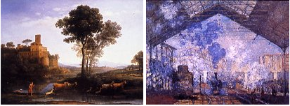
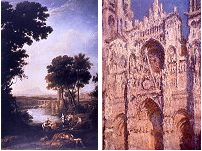
Claude Lorrain and Claude Monet offer good examples of the two basic styles of painting: indirect and direct painting.
Structure of the painting: direct vs. indirect
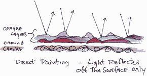
The classical approach to painting is called indirect because what you see is a combination of three or more layers of the painting. The viewer sees all three layers visible simultaneously in different parts of the painting. The artist carefully plans the layering to create specific visual effects.
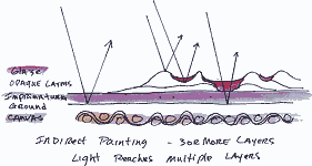
Look at the diagram I drew to help it make sense. Here we are looking at the side view of a painting.
- The canvas is at the bottom
- The white ground on top of the canvas
- The actual paint layers on the ground.
The first layer, called the imprimatura , is applied over the image drawn onto the ground.
A thin “wash” of oil color establishes the middle tone of the painting. Often painters use a dark transparent color like burnt sienna applied over a white ground so the surface of the painting appears to sparkle softly.
If the artist had applied a dark opaque layer instead of a transparent layer, the dark color would have absorbed all the light so the painting will look very flat. You can see that my light ray goes all the way through that layer to the ground.
 The next layer the artist applies is opaque. Into this layer, s/he paints most of the human forms and other elements to create the story and give the painting its narrative drive. Some painters, especially Rembrandt, painted this layer as an impasto layer – a layer built of thickly applied oil paint.
The third layer may be a single layer or a series of layers of transparent glazes. Glaze layers are used to
- unify the color of the light
- control the intensity of the light
- push forms and elements to create the sense of three-dimensional space.
Glazes add dimension because of their transparency. In Claude Lorrain’s day, artists created transparency by adding painting mediums to their paints to spread the particles of pigments apart. Today, artists can use transparent pigments to create the same effect.
In the diagram, the glazes are red.
You can see that the light rays bounce right off the opaque layer, but go through the transparent glaze layer. Light interacts with glazes in an interesting way. IT LIGHTS THEM FROM BEHIND.
Light travels inside the painting’s surface. Then the light is colored by the glaze as it returns to the eye. Applying many glazes make paintings look darker because so much light is trapped inside the paint film. You can see that there are four light rays on this diagram to show the four ways that light can interact with the surface. Rembrandt is a master of indirect layering of color.
You can see
- the imprimatura in the background
- the opaque painting of the forms
- the glazing more or less over all the forms, giving volume to the forms.
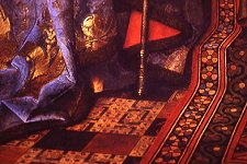
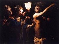 Layering glazes can increase the sense of drama as in this painting by the Candlelight Master, “St. Sebastian Cared for by Irene”—The drama of the narrative is heightened by this darkened scene so the tension intensifies in the darkness. The painter achieves this effect by using transparency to allow light deep inside the picture. The painting’s glowing effect is achieved as the light is allowed to come out softly.
For hundreds of years, until the Impressionists, painters constructed their paintings in exactly this way with about the same palette of colors, telling the same stories. Their genius was determined by the unique ways in which they transformed art materials into narratives that tell us our stories.
Direct Painting
The Impressionists were the first to use direct painting.
Most of the colors of the Old Masters were transparent, most of the colors of the Impressionists were opaque. See the diagram, there are no transparent layers.
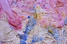
Here is a detail of an opaque surface with heavily applied impasto paint layers. All the light rays bounce right off the surface. None of the light penetrates into the layers. The light you see, the color you see, comes right off the surface. The painter may have applied a few more layers but all prior work is covered up. Perhaps only the texture of the under layers is visible on the surface.
Here are a few examples of direct painting:
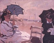
This is Monet painting at the beach. If you could see this closely there is a lot of sand stuck on the surface.
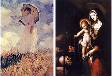
Compare this Monet with Chalette’s “The Virgin and Child Visiting Prisoners.” I think the differences how light interacts with the surface is clear. One takes it in and only gives part of it back. The other reflects light back from all over the surface.
The Impressionists took their bright, opaque colors into the landscape. This direct painting structure is the only one that works well for creating outdoor light because the natural world is characterized by light flooding the landscape. To make a painting that creates this feeling of flooding light, the painter must make sure lots of light bounces right back at the viewer.
They do this by using opaque colors at a bright value that reflect light right off the surface, not allowing light to get into the structure and get absorbed inside the paint film. This achieves the feeling of brightness from an actual brightness.
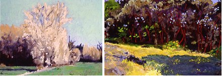
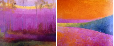
My personal work attempts to achieve these same goals. Here are a few examples. Most were painted here in the Willamette valley.
Palette of colors available
Now let’s look at colors that formed their palettes. The classical painter used a very different array of colors than the impressionists.
Artists have been creating paintings for at least 30,000 years. There are only essentially three periods of pigment history.
The first period starts 30,000 years ago and goes up to 1700 at the beginning of the Industrial Revolution. This period of art history is characterized by the use of pigments that were mostly materials found in the earth: pigments from earth such as siennas, umbers, iron reds, or colors from stones: lapis, malachite, azurite, or natural organic substances such as berries, saps, bug juice, plant juice.
 Most of the colors used were earth colors. But a prosperous painter like Van Eyke, who lived in a center of commerce such as Bruges, had access to more brightly colored materials.
Then the Industrial Revolution from 1700 to 1900 gave a full palette of colors that were made by fusing metals together at high heat to create mixed metal oxides from cobalt, manganese, iron, cadmium, lead among others.
 All the paintings in The Triumph of French Painting show were produced with colors from the first period; the impressionists were using colors from the second period.
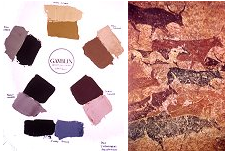
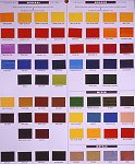
For those of you who are interested, the third period was the 20th century which gave us a full palette of modern organic colors: quinacridone, phthalo, napthol for examples. At left is a color chart of all of the colors available today.
The earth colors of the first period are here, the colors of the Industrial Revolution are here. The modern organic colors of the 20th century are here.
And here are paintings by my teacher, Wolf Kahn, who paints the landscape but uses a lot of colors from the 20th century.
That was a brief overview of the history of pigments, lets now get more focused about this.
Following are two paintings that show artists palettes, it is interesting that they have almost the exact same colors on the palette.
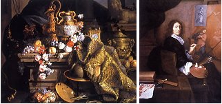
White, a few earth colors, and red. No blue, no green, no violet, and there is no blue, green, or violet in the paintings.
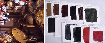
So here is a group of colors common from the classical period: ocher, umber, sienna, terre verte, ivory black, lead white, smalt, verdigris, vermillion, rose madder. Compare those to the colors on the palettes from this painting, and you see most of the same colors. But what I want you to notice is that there are lots of muted colors and few bright colors.
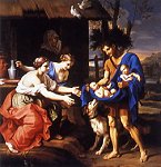 Here is one more from the show to illustrate once more their use of color: the narrative is depicted in value using muted colors; the bright colors used for dramatic effect.
The Impressionists were fortunate that the colors they needed to paint the light of the natural world and their desire to do it happened at the same time. Before the mid 19th century, the pigments were not available for the Impressionists. They would have had their artistic vision but no tools with which to bring their ideas to life. By 1860-75 a full array of opaque, lightfast colors had been developed for industry that the artists began using. This is an interesting transition. In the first stage of pigment history, the artists or their apprentices made most materials in the studio. Pigments were bought from the apothecary but turned into paint in the studio. By mid 19th century, industry had created new pigments in large quantities to be used for the first time for industrial use. And these pigments were also made into artists’ paints by small manufacturers. This is the origin of our type of business.
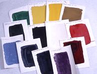
Notice the set of swatches of a basic Impressionists palette. There are enough pure colors that I can now make a color wheel out of the colors at regular steps around that color wheel. All colors are intense with the exception of the Yellow Ochre. The impressionists threw out all earth colors except for Yellow Ochre. It was kept because it was just too valuable. It was the color of the road, or the beach, or the walls in the village.
The value of this palette is the availability of pure colors at regular steps around the color wheel so artists can have access to a great amount of color space. And this is what is required to paint all the lighting situations one might find. The added advantage of these bright mineral colors is they give up the intensity of their color when they are mixed with other colors. The mineral colors easily grey down into the colors of the natural world. The light of the world has both, muted color and intense color.
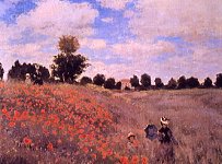
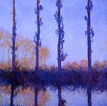
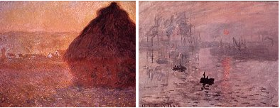
As exemplified by this painting of Monet, the field of poppies, intense poppies muted grasses, beautiful recreation of late summer light.
Use of Color, drama vs. scientific, vs. physiological
The next difference to consider is HOW the artists used their colors.
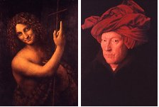
The narrative in classical painting is depicted primarily in value. The effect is usually achieved using muted colors. See this Leonardo on the left. There are no colors but muted colors. St John’s body is painted in white, but all the rest is in earth colors. And that body has been glazed back with transparent earth colors.
Earth colors were the basic palette for most painters who then reserved the brighter colors, if they had them, to carry the dramatic effect. Van Eyke’s extravagant use of a very expensive vermillion demonstrates the status and wealth of the subject. They think that this may be a self-portrait that he painted for promotion of his portrait painting business.
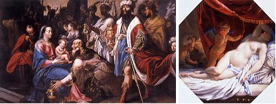
“The Adoration of the Magi” looks like a scene right out of a dramatic play. The characters dressed in brightly colored robes carry the dramatic element. Imagine them all painted in earth colors, the drama would be greatly diminished. The glowing red in the sleeping Venus increases the heat of the vision, I am sure that artists of that time intuitively knew what today’s scientists have proven, that looking at red makes the heart beat a little faster.
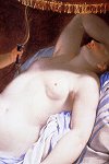
The artist has created a translucent glow in certain parts of the bodies. It is produced by a careful mixture and application of both transparent and opaque colors to allow light into the surface just a little, then be sent back out. Juxtaposing this intensity with shadow enhances the effect.
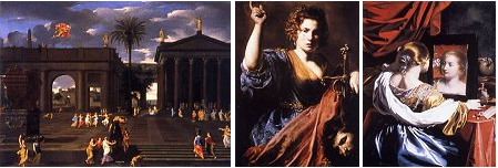
One more use of color in classical times was to purely show off.
In “Saint Anne Taking the Virgin to the Temple,” (which is also in the show), the use of Ultramarine Blue seems to be the reason to paint the picture. Ultramarine Blue made from lapis is the most expensive pigment ever created. When the patron requested Ultramarine blue be used in a painting, the contract would state where it was going to be used and how much money was going to be made available for the purchase of the pigment. This work looks like a status symbol picture to me.
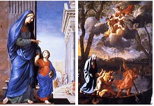
Color was also used symbolically. Poussin dressed the Virgin Mary in blue. Why Joseph is in yellow I do not know, except perhaps as a visual effect to draw your eye from the boat to the figures in the clouds.
On the other hand, as I mentioned a moment ago, Impressionist painting used color to depict the full range of light effects of the natural world.
I keep coming back to Monet because his accomplishment is astounding. When I was in my 20’s and too cool like twenty-year-olds can be, I loved impressionism, but did not think much of Monet. Since the masses liked Monet best, I figured they must have been wrong. But now that I am considerably less cool than I was at 25, I am in awe of his accomplishment.
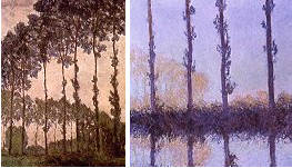
An interesting side bar to the story of his poplar series is that he started painting them then learned that the trees were slated to be auctioned off to be logged. Monet went to one of the logging companies bidding on the trees. He asked the owner what he was willing to pay for the trees, and then guaranteed to pay him what ever he had to pay above that amount that was needed to win the bid. The man won the bid, Monet paid the extra amount, and he was able to complete his series before they were cut down. But again, they illustrate this interest of the impressionists in using color to explore the light of the world in all of its permutations.
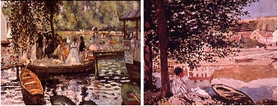
Here is another effect of natural light, Renoir on the left, Monet on the right, both painting summer light with dappled shade
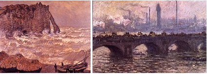
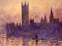
Monet here again, painting a stormy day at the beach, and from his marvelous London series painting the Thames river, bridges, houses of parliament, and the incredible London fog of the early 1900’s
Intention of the artists, role of art in life
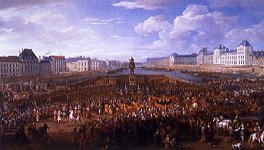
The last topic I want to discuss is the difference in intention between artists who worked in the classical tradition and modern artists. The role of painting in society has changed dramatically since the 17th century! So to appreciate their work, I think we should understand the artists’ intentions and how they met the cultural demands of their times. Much of classical painting was commissioned by religious leaders to tell and re-tell the stories of the faithful. Or politics – painting to commemorate historic moments, or court life—as in these two works from the show.
Their patrons loved these grand gestures that commemorated their achievements and gave them a mark on history. Stories told by oil paintings made using established techniques and artists’ quality materials can live for hundreds of years.
At this time painting was the highest form of visually recording the human experience. The only reason we have an idea of what life looked like was from painting. But the grand style – the narrative was the highest form of visual story telling.
Depictions of Greek myths Mercury and Herse on the left, or religious stories such as the story of Judith from the bible, no that is not the head of her husband, but that of an enemy general.
 But what I hope you see is that what many classical paintings have in common is that they all look like still shots from dramatic play. Painting was the only visual medium that contained drama.
It’s been a long time since we have gone to painting as our primary source of visual drama or even visual story telling; we go to TV and Movies.
For the last 100 years, painting has been freed from the responsibility to provide drama or recording significant events. Photography freed painting from the primary responsibility of telling us how things look. Painting could have died with these two important parts of the market removed, but as a testament to the primal power of painting, it evolved to fulfill other cultural needs.
The Impressionists created this new role for painting.
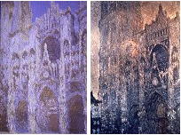
Their work was the product of an amazing confluence: of ideas and materials. This section of the talk is about intentions. Their intentions were to bring a scientific way of thinking to art. Instead of painting the light of the studio, these modern painters concerned themselves with exploring scientific views of the world. They depicted the light of the world. Storytelling and drama were not important intentions. Here are two of Monet’s paintings of Rouen cathedral, as with so many of Monet’s series he made many paintings of each subject to study the effects of light at different times of the day, and different types of weather.
Along with this new look at the world, the impressionists gave us a new element of humanity as a focus for painting. And this is pure feeling produced by color and light without a narrative to guide the experience.
Two more Monets showing the use of color to evoke an emotional response.
As a backdrop for final remarks, I return to Claude and Claude.
We are living now in what has been characterized as a “Post-Modern” art world. In this post-modernism, all styles, or art-making mediums ever invented can be seen on the walls of today’s art galleries. But still, all painting uses only one of the two structures we have been examining. Paintings either invite light into the surface sometimes more, sometimes less or cause it to bounce right off the surface. Still, the artists rule and by transforming art materials, they leave us a visual record of our culture, our ideas, and our emotions. And personally, I think we are the richer for all of this diversity.
If you have any further questions about why classical and contemporary paintings look so different, please feel free to contact us.
Robert Gamblin
![]()
Credit: The Houses of Parliament, 1903 (oil on canvas) by Monet, Claude (1840-1926)
© Brooklyn Museum of Art, New York, USA/ The Bridgeman Art Library
Credit: A Man in a Turban, 1433 (oil on oak) by Eyck, Jan van (c.1390-1441)
©National Gallery, London, UK/ The Bridgeman Art Library
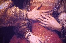
Credit: The Jewish Bride, c.1666 (oil on canvas) by Rembrandt Harmensz. van Rijn (1606-69)
©Rijksmuseum, Amsterdam, Holland/ The Bridgeman Art Library
Credit: Waterloo Bridge, 1902 (oil on canvas) by Monet, Claude (1840-1926)
©Hamburger Kunsthalle, Hamburg, Germany/ The Bridgeman Art Library
Credit: Judith (oil on canvas) by Valentin de Boulogne, (1594-1632)
©Musee des Augustins, Toulouse, France/ Giraudon/ The Bridgeman Art Library
Credit: Woman with Parasol turned to the Left, 1886 (oil on canvas) by Monet, Claude (1840-1926)
©Musee d’Orsay, Paris, France/ Giraudon/ The Bridgeman Art Library
Credit: The Gare St. Lazare, 1877 (oil on canvas) by Monet, Claude (1840-1926)
©Musee d’Orsay, Paris, France/ The Bridgeman Art Library
Credit: Rouen Cathedral Facade and Tour d’Albane (Morning Effect) 1894 (oil on canvas) by Monet, Claude (1840-1926)
© Museum of Fine Arts, Boston, Massachusetts, USA/ Tompkins Collection/ The Bridgeman Art Library
Credit: Grainstack (Sunset) 1891 (oil on canvas) by Monet, Claude (1840-1926)
© Museum of Fine Arts, Boston, Massachusetts, USA/ Juliana Cheney Edwards Collection/ The Bridgeman Art Library
Credit: St. John the Baptist, 1513-16 (oil on canvas) by Vinci, Leonardo da (1452-1519)
©Louvre, Paris, France/ The Bridgeman Art Library
Credit: Rough Sea at Etretat, 1883 (oil on canvas) by Monet, Claude (1840-1926)
©Musee des Beaux-Arts, Lyon, France/ Giraudon/ The Bridgeman Art Library
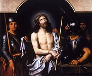
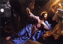
Credit: Ecce Homo (oil on canvas) by Mignard, Pierre (1612-95)
©Musee des Beaux-Arts, Rouen, France/ Lauros / Giraudon/ The Bridgeman Art Library
Credit: St. Anne Leading the Virgin to the Temple, c.1635-45 (oil on canvas) by Stella, Jacques (1596-1657)
©Musee des Beaux-Arts, Rouen, France/ Lauros / Giraudon/ The Bridgeman Art Library
Credit: Rouen Cathedral in Full Sunlight: Harmony in Blue and Gold, 1894 by Monet, Claude (1840-1926)
©Musee d’Orsay, Paris, France/ Lauros / Giraudon/ The Bridgeman Art Library
Credit: Impression: Sunrise, Le Havre, 1872 (oil on canvas) by Monet, Claude (1840-1926)
©Musee Marmottan, Paris, France/ Giraudon/ The Bridgeman Art Library
Credit: The Judgement of Paris, c.1632-35 (oil on panel) by Rubens, Peter Paul (1577-1640)
©National Gallery, London, UK/ The Bridgeman Art Library
Credit: The Beach at Trouville, 1870 (oil on canvas) by Monet, Claude (1840-1926)
©National Gallery, London, UK/ The Bridgeman Art Library
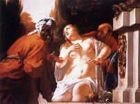
Credit: Susanna and the Elders by Blanchard, Jacques (1600-38)
©Agnew & Sons, London, UK/ © Agnew’s, London, UK/ The Bridgeman Art Library
Credit: The Procession of Louis XIV (1638-1715) Across the Pont Neuf (oil on canvas) by Meulen, Adam Frans van der (1632-90)
©Musee de Grenoble, France/ Peter Willi/ The Bridgeman Art Library