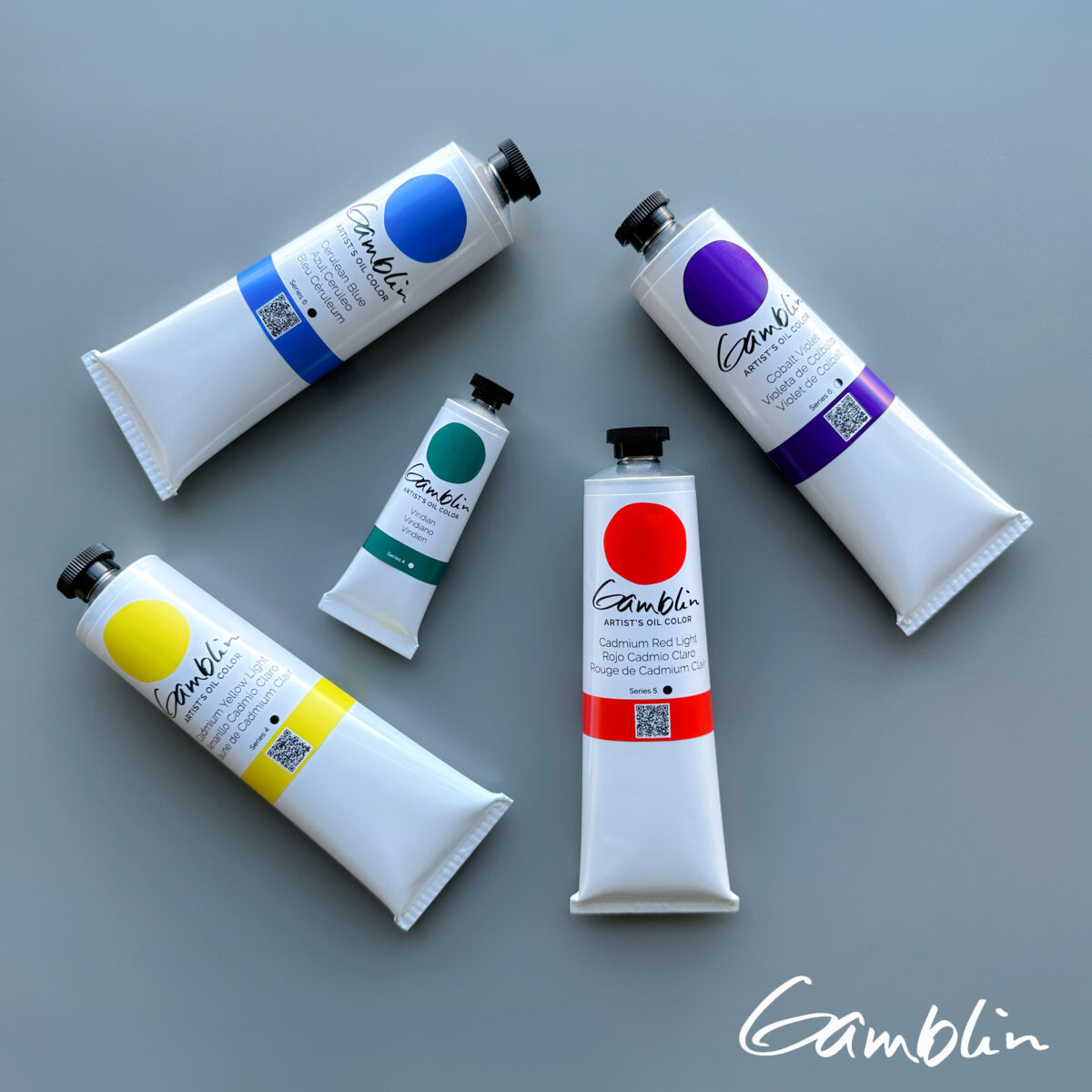
Made with the highest grade pigment, refined linseed (flax) oil and safflower oil, Gamblin Artist’s Oil Colors have strong pigmentation and luscious working properties. Each color possesses unique characteristics in terms of texture, undertone, and tinting strength. This professional range of colors includes both historically accurate paints and modern hues. For everything from traditional realism to contemporary abstraction, you’ll find your ideal colors within the Gamblin Artist’s Oil Color line.
The color yellow appears to advance. It has the highest reflectivity of any color.
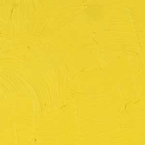
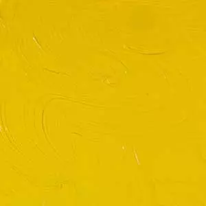
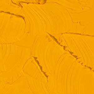
Today hearing “yellow” many painters will think of Cadmium Yellow – brilliant and opaque. Cadmium Yellow replaced toxic chrome (lead) yellows. Although more expensive than Chrome Yellow, Cadmium Yellow was used by landscape painters, including Claude Monet, because of its higher chroma and its greater purity of color.
Painters today can choose from among the cadmium yellows of the impressionists as well as the modern and more transparent hansa yellows. Hansa yellows retain their intensity in tints and make beautiful glazes. Hansa Yellows can boost cadmiums in mixes; enabling brighter secondaries. Indian Yellow has been prized for hundreds of years and is ideally suited for glazing. In its transparency, it makes a glowing warm yellow—as if a painting were suddenly lit with summer sunshine.
Before the Industrial Revolution, painters used Yellow Ochres or Orpiment (sulfide of arsenic). Occasionally painters found some Gamboge, a strongly colored secretion from trees that resembles amber. Gamboge was used for glazing before Indian Yellow became available in the middle of the 19th century. To make Indian Yellow, cows were force fed mango leaves and given no water. Their urine was collected in dirt balls and sold as “pigment.” The resulting artists’ color was a warm transparent glazing yellow. But Indian Yellow was lost somewhere between the decline of cruelty to animals and the rise of manufactured pigments.
In the 20th century, the most transparent of the yellows that we at Gamblin call “Indian Yellow” is a light stable diarylide pigment. In its transparency, it makes a glowing warm yellow—as if a painting were suddenly lit with summer sunshine.
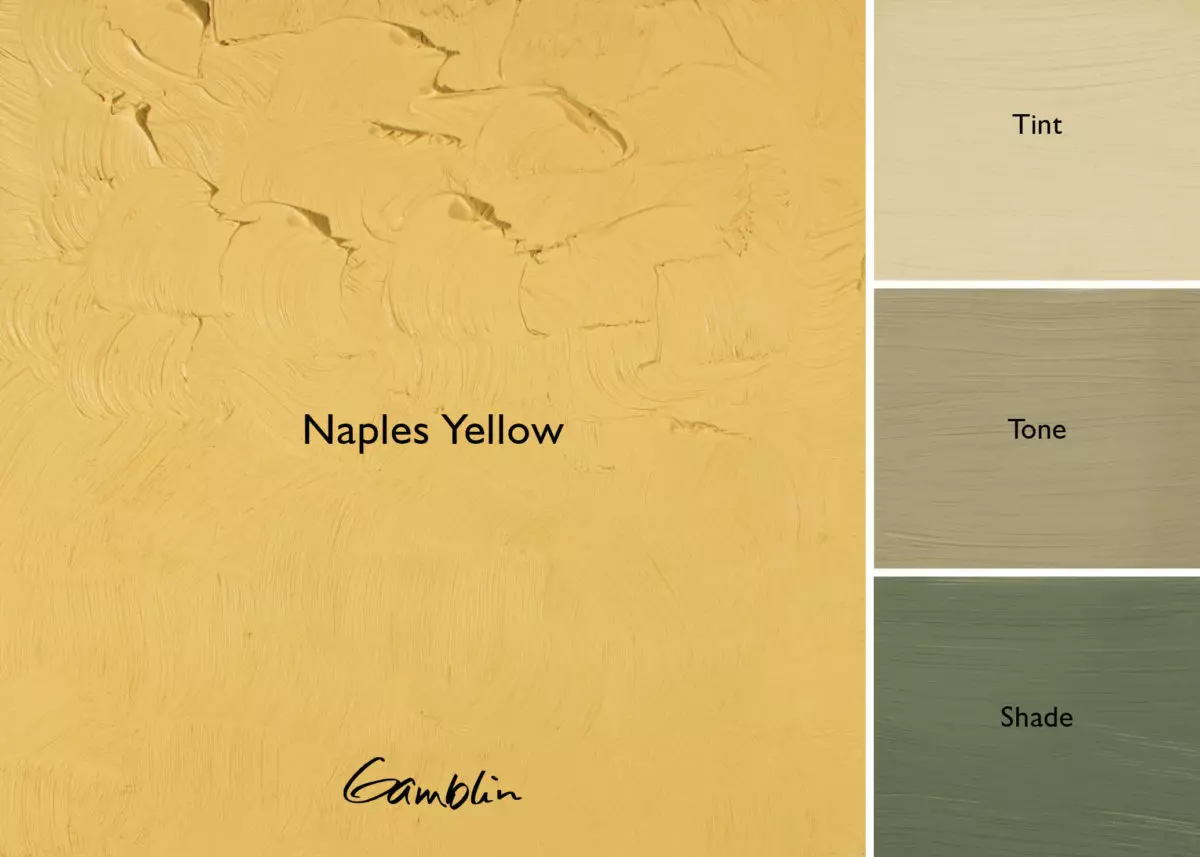
A color with obscure origins, Naples Yellow was originally lead antimoniate. Assyrian artists used this pigment to make ceramic glaze. Contemporary history of this color begins in the 18th century but “Naples Yellow” means more a color than a chemical composition. Rubens used this color extensively for skin tones. Because the original pigment is lead based, Robert Gamblin formulated an excellent copy at a reasonable price.
Hansa yellow pigments were first made in Germany just before World War I. They are organic pigments that are semi-transparent and lightfast (Hansa Yellow Light is Lightfastness II, and Hansa Yellow Medium & Deep are Lightfastness I). In their masstones, Hansa Yellows resemble Cadmium Yellows but the similarity ends there. Hansa Yellows make more intense tints and cleaner secondaries, especially when mixed with other organic (modern) colors like Phthalo Blue and Green. Because they are more transparent, Hansa Yellows have great value as glazing colors. Painters can also take advantage of the “temperature” shifts of the Hansas –- from coolest yellow (Hansa Yellow Light) to warm golden yellow (Hansa Yellow Deep).
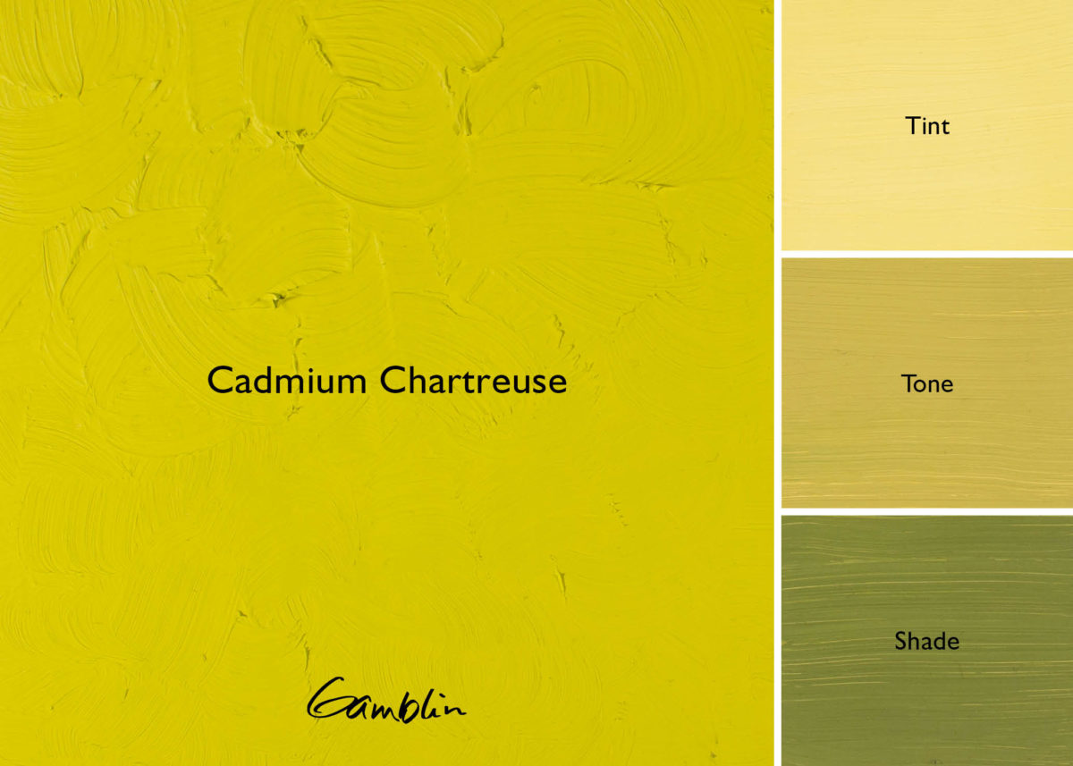
Cadmium Chartreuse: This opaque greenish-yellow, close to the “line” between yellow and green, fills a gap in color space between Cadmium Lemon and Cadmium Green. Cadmium Chartreuse is among the most intense colors in the Gamblin palette.
Pigment: CP cadmium zinc sulfide, phthalo emerald (PY 35, PG 36) Vehicle: Alkali refined linseed oil Lightfastness I, Series 4, OPAQUE Color Temperature: Cool SDS
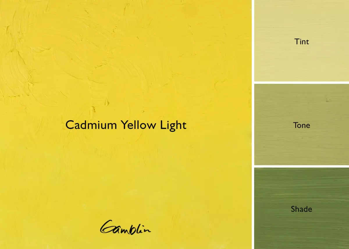
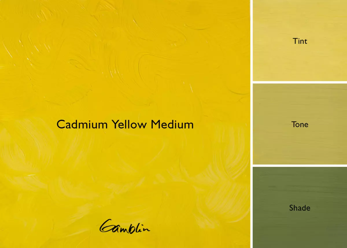
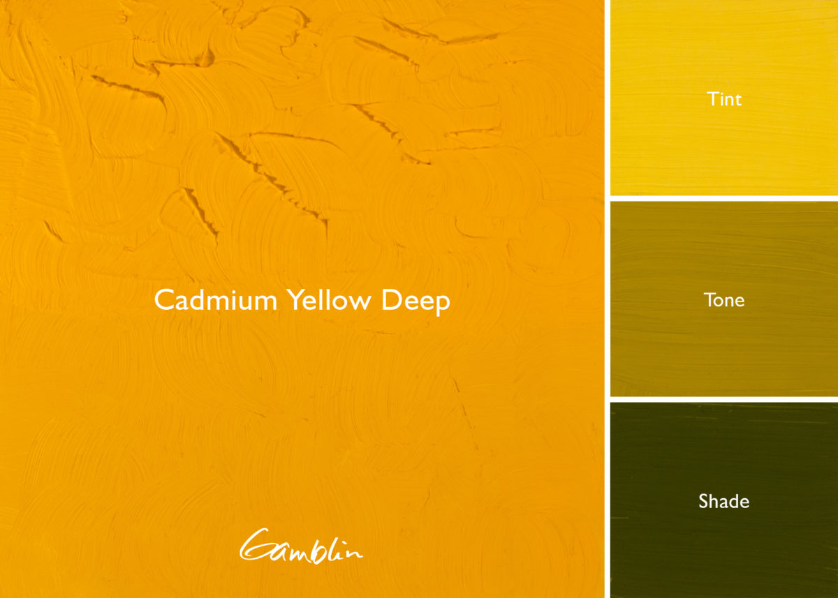
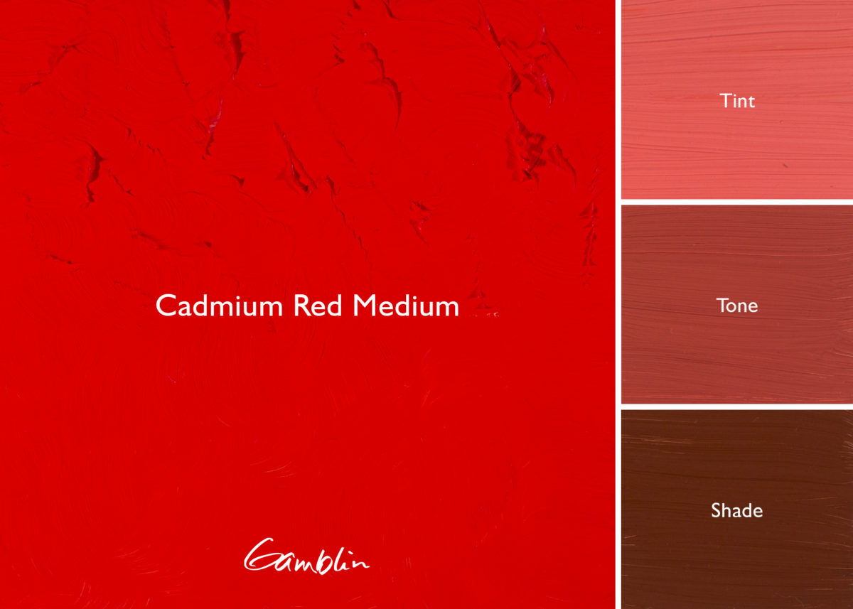
Cadmium Yellow Medium: Pure medium yellow with great opacity and naturally muted tint. This chemically pure cadmium color replaced toxic chrome yellow for the Impressionists. Most useful for natural light painting.
Pigment: Concentrated cadmium sulfide (PY 37) Vehicle: Alkali refined linseed oil Lightfastness I, Series 4, OPAQUE Color Temperature: Warm SDS
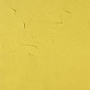
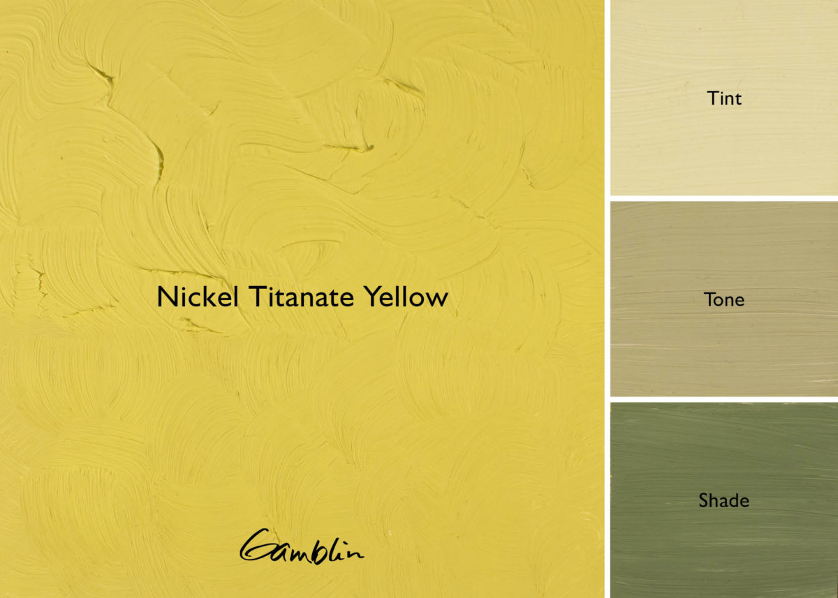
Nickel Titanate Yellow: An opaque, relatively muted yellow. Whereas most muted yellows, such as Yellow Ochre and Naples Yellow Hue, lean toward the warm side of yellow, Nickel Titanate is a cool, greenish yellow. Its tendency to grey down in tints and mixtures makes it valuable for painting natural light, as well as having a color resonance that abstract painters will find valuable.
Pigment: Nickel Antimony Titanium Yellow (PY 53) Vehicle: Alkali refined linseed oil Lightfastness I, Series 3, OPAQUE Color Temperature: Cool SDS
Hansa Yellow Light: Hansa Yellows are not Cadmium wannabes! Coolest yellow. Cleaner in masstone, brighter in tint, more transparent, try using Hansa Yellow Light instead of Cad Yellow Light where transparency is desired. Also useful to intensify tint of Cadmium Yellows.
Pigment: Arylide yellow (PY3) Vehicle: Alkali refined linseed oil Lightfastness II, Series 3, SEMI-TRANSPARENT Color Temperature: Cool SDS
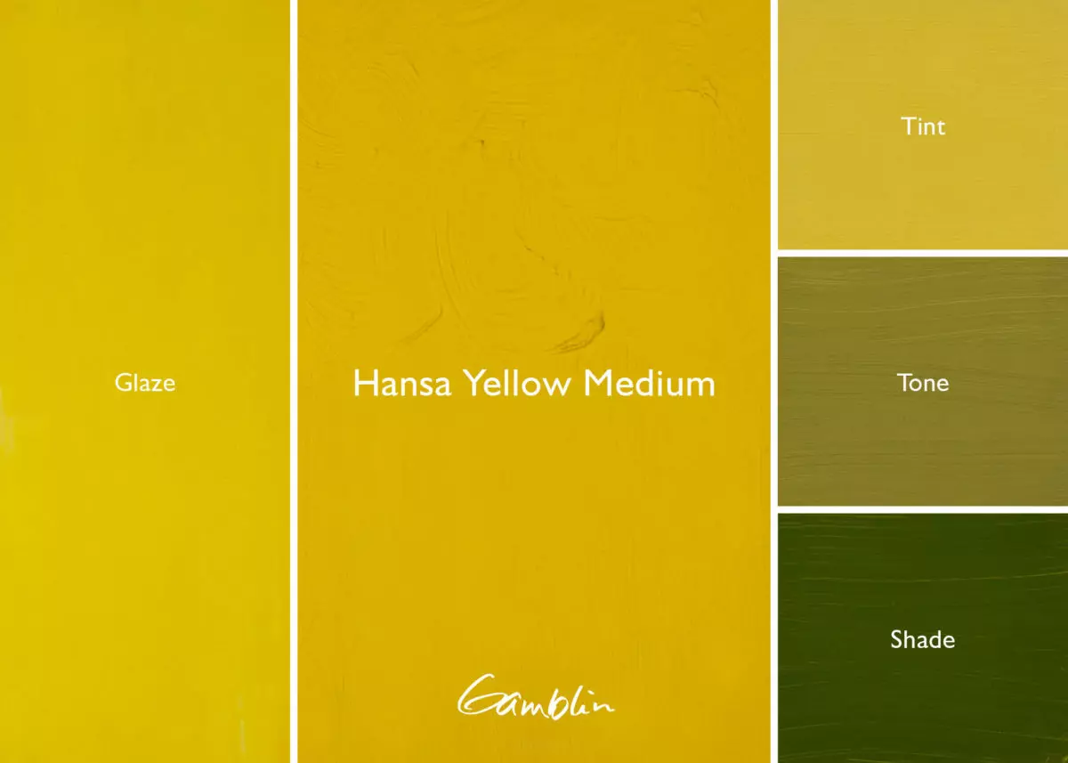
Hansa Yellow Medium: Its masstone is very similar to Cadmium Yellow Medium but semi- transparent. Clean, bright tint. Use in place of Cadmium Yellow where higher key tint is desired. Also Hansa Yellows’ transparencies make them useful for mixing cleaner, brighter secondary color mixtures.
Pigment: Arylide yellow (PY 74) Vehicle: Alkali refined linseed oil Lightfastness I, Series 3, SEMI-TRANSPARENT Color Temperature: Warm SDS
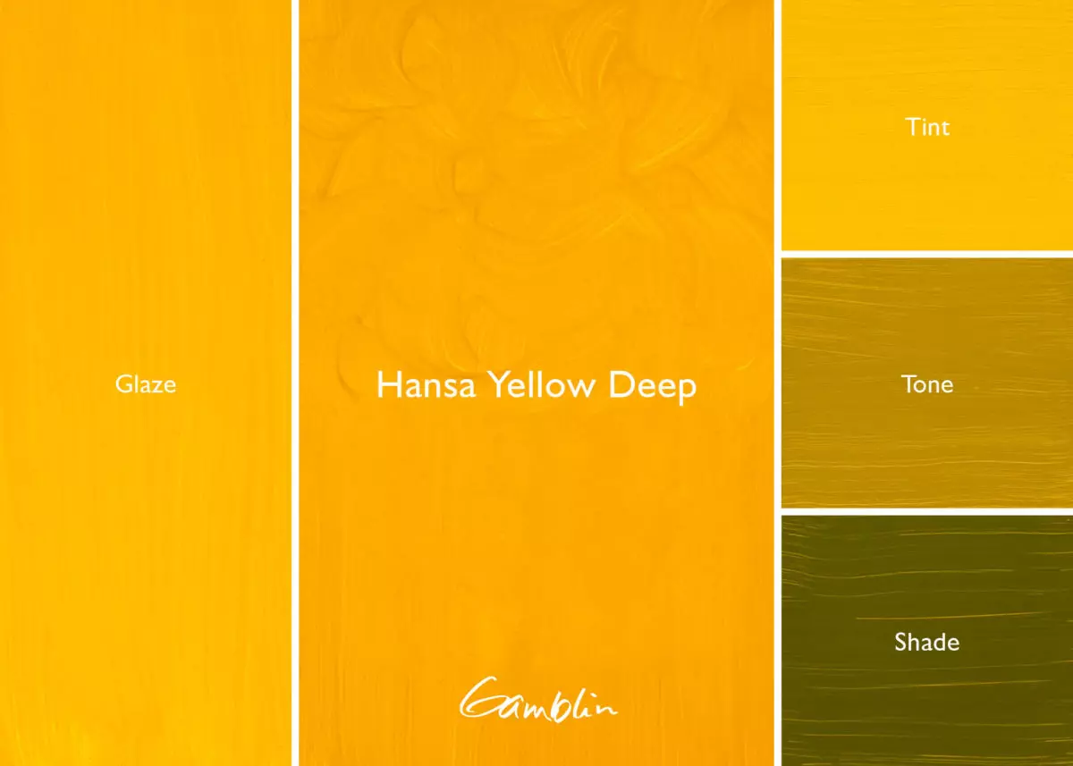
Hansa Yellow Deep: While this color has not been tested for Lightfastness by ASTM, it is being used to paint the yellow stripe on city streets! Golden yellow, warmest of the Gamblin Hansa Yellow colors.
Pigment: Arylide yellow (PY 75) Vehicle: Alkali refined linseed oil Lightfastness NT, Series 3, SEMI-TRANSPARENT Color Temperature: Warm SDS
When deepened, orange – unlike red and yellow – becomes brighter instead of darker. Few colorants produce pure orange. During the Middle Ages, orange mineral provided a rich, opaque pigment for easel painting and illuminated manuscripts.
Near the end of the 18th century, the emerging commercial paint industry developed synthetic iron oxides, “Mars Colors,” which made more predictable colors than natural earth pigments. Used for color consistency and opacity, Mars colors range from orange to dark red/purple.
Today, painters have several orange options. Painters like Wolf Kahn reach for Gamblin Transparent Orange, a warm color unique to the Gamblin palette.
Orange is the color of safety: orange life vests are easily seen on dark and stormy seas. Always a warm advancing color, orange is the forerunner of the sun.
During the Middle Ages, orange mineral, also called minium, provided a rich and opaque pigment that was used in easel painting and illuminated manuscripts. It was made by prolonged heating of white lead over an open fire. Noticeably toxic, Chinese bookmakers painted the edges of paper with orange mineral to save their books from silverfish. Orpiment, an extremely poisonous sulfide of arsenic, was mined as a yellow to reddish-yellow pigment. Its noxious sulfur fumes and highly reactive properties made orpiment a color of last choice. Realgar, another poisonous pigment found in the earth, made a better orange, but it was incompatible with lead or copper-based pigments.
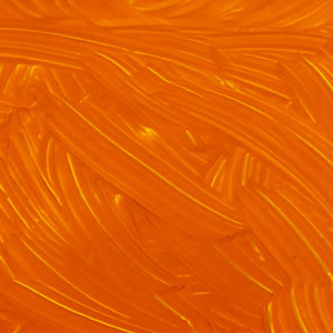
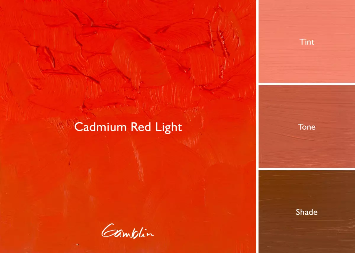
Cadmium Orange was the first true orange. It is a pure hue with excellent opacity and low toxicity compared to its predecessors. Around 1820, yellow cadmium sulfide was discovered as an impurity in the processing of zinc ores. The name cadmium is derived from cadmia fornacum, a type of furnace used to smelt zinc. In experiments, chemists used hydrogen sulfide to precipitate the yellow colorant from solutions of cadmium salts. By 1880, they further discovered by gradually increasing the amount of selenium, they could produce deeper shades of cadmium orange and all shades of cadmium red.
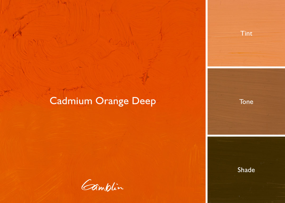
Cadmium Orange: Gamblin Cadmium Colors are in regular chromatic steps from Cadmium Yellow Light through Cadmium Red Deep. Chemically pure Cadmium Orange is a medium opaque orange.
Pigment: Concentrated cadmium sulfo-selenide (PO 20) Vehicle: Alkali refined linseed oil Lightfastness I, Series 4, OPAQUE Color Temperature: Warm SDS
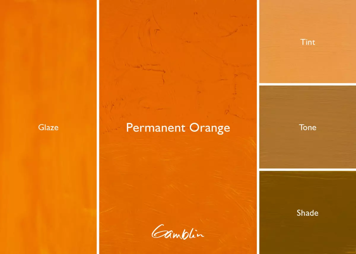
Permanent Orange: A modern high key color with a pure hue and the same masstone (but more transparent) than Cadmium Orange, and it remains brighter in its tint when mixed with white. Painters cannot mix a secondary with the same purity of this pure hue Orange. When you use it thinly a rich glowing glaze is created.
Pigment: Monoacetolone (PO 62) Vehicle: Alkali refined linseed oil Lightfastness I, Series 3, SEMI-TRANSPARENT Color Temperature: Warm SDS
Transparent Orange: This is Wolf Kahn’s signature color. Noted for its transparency and warm yellow undertone, it can be used as a completely transparent glazing color. Painters can create subtle color shifts by applying various thicknesses of transparent orange.
Pigment: Diarylide Yellow, Perylene Red (PY83, PR149) Vehicle: Alkali refined linseed oil Lightfastness I, Series 3, TRANSPARENT Color Temperature: Warm SDS
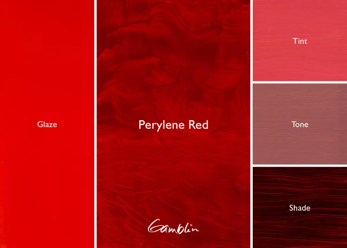
Since the introduction of Cadmiums at the turn of the 20th century, the red hue family has greatly expanded to include such colors as the semi-transparent Napthol and Perinone Reds and the transparent Quinacridone Reds.
Using transparent reds opens possibilities unthinkable before this century. Instead of making glazes by thinning down an opaque color (which doesn’t increase transparency) or choosing the less lightfast alizarins, painters can use Perylene Red, a warm lightfast red that is completely transparent. Just imagine what Turner might have done with these reds!
Until the late 20th century, scientists were not able to tell the difference between human blood and earth red (ferric) iron oxide pigments. Vermillion was an alchemical mixture from the 9th century AD. Combining sulfur and mercury may have been an attempt to produce the philosopher’s stone. The resulting bright, opaque red was a marvel short of philosophy but a delight to painters for a thousand years. The earth red and vermillion colors were prepared by Robert Gamblin for a Smithsonian Institute research project and are not available from Gamblin Artists Colors.
Early artists knew the difference between fugitive and permanent pigments. They realized earth reds do not change through time or as a result of climate. Earth colors are rated ASTM Lightfastness I – the highest lightfastness rating. Iron oxide deposits are still found all over the world. Anthropologists believe the hematite (anhydrous ferric oxide) mines in South Africa have been worked for more than 40,000 years. There is an almost universal use of red pigment for funerary purposes. The underground color suggests an association with life-sustaining blood. Hematite is a natural form of iron oxide red found in Neanderthal caves where 20,000 to 35,000-year-old bodies had been completely submerged in the red pigment.
Cinnabar, the principal ore of mercury came from the Almaden mines of Spain for the artists of Pompeii. Cinnabar, a soft earthy lump of bright red, was an ingredient in recipes for preparing the philosopher’s stone as well as the artists’ color, Vermillion. Since the thirteenth century CE, red artists’ color has been artificially synthesized from mercury and sulfur. Vermillion is a dense opaque color that may blacken when exposed to the air or when painted next to white lead. Red lead, which definitely blackens in air, was used as a substitute for genuine Vermillion because it was a less expensive pigment. By the 1930’s, lightfast, permanent with considerably lower toxicity, Cadmium Red had replaced Vermillion on artists’ palettes.
The red earths are common in mural painting and easel painting throughout history. Although completely permanent and lightfast, red earths are dull when compared with the bright reds made from mercury. Other reds were made from organic matter, such as the madder root, dried bodies of insects or pomegranate peel.
It was 1868 before Alizarin was extracted from the madder root. Alizarin Crimson is the least permanent red color commonly found in artists’ palettes today. The madder root and Alizarin colors prepared by Robert Gamblin for a Smithsonian Institute research project are not available from Gamblin Artists Colors.
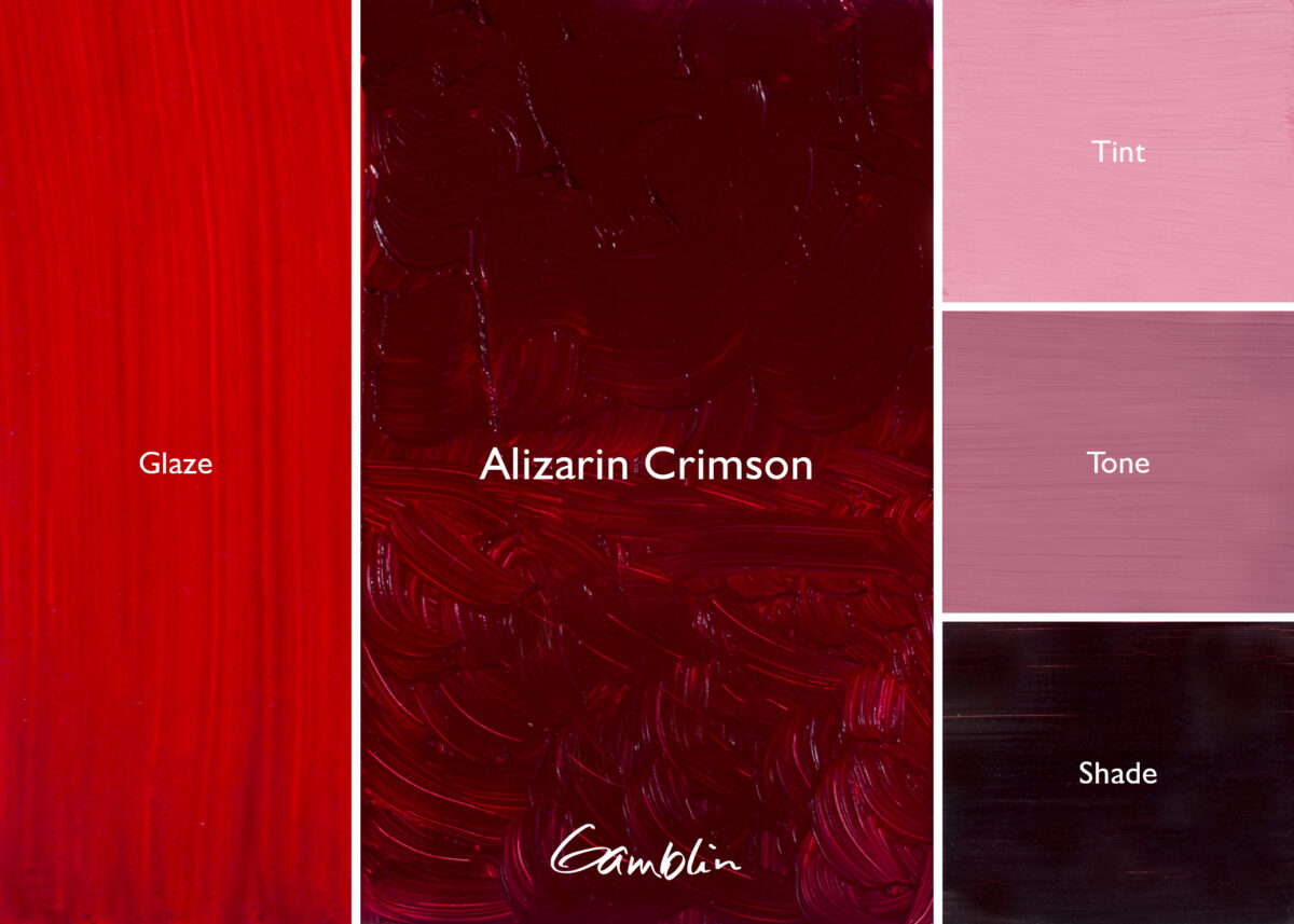
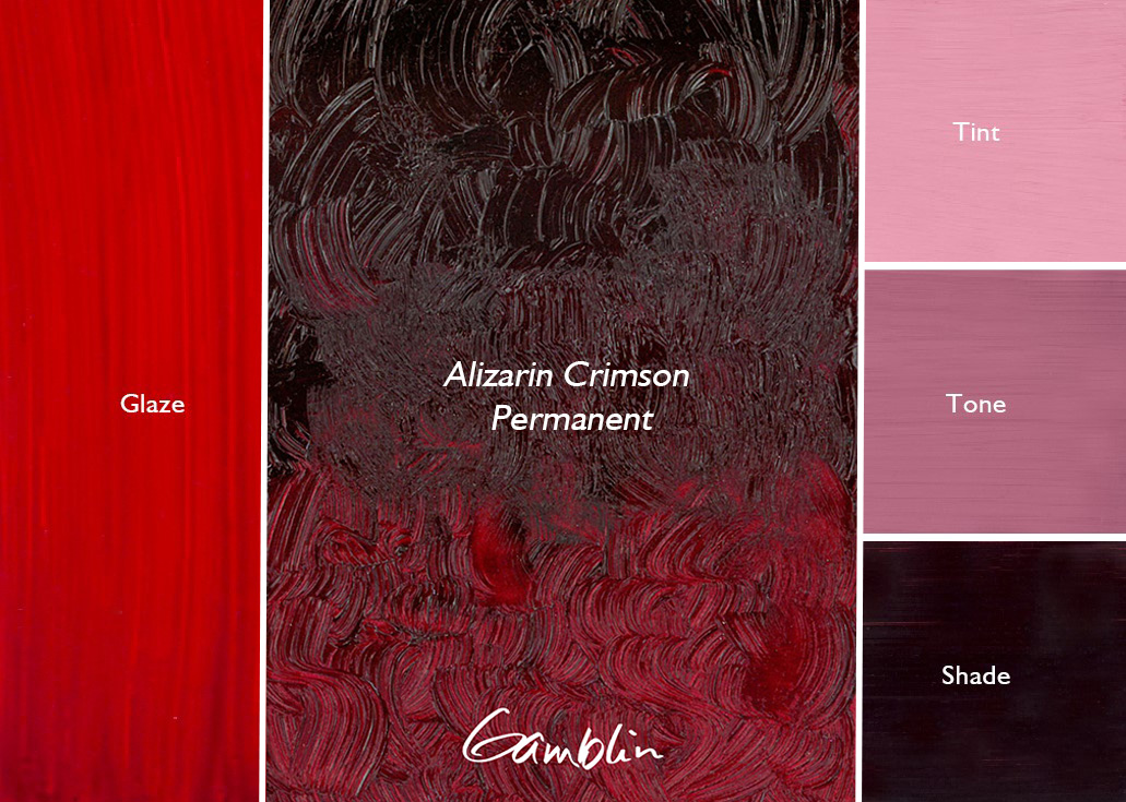
Alizarin Crimson: Cool, slightly bluish red with smoky glaze. 19th century “lake” color made by the fusing a dye on to a substrate. Only Alizarin Crimson is still commonly used by painters today.
Pigment: Synthetic 1:2 dihydroxyanthraquinone on alumina (PR 83) Vehicle: Alkali refined linseed oil Lightfastness III, Series 3, TRANSPARENT Color Temperature: Cool SDS
Alizarin Crimson Permanent: Cool, slightly bluish red with smoky glaze. Excellent match in masstone, transparency, and tint compared to the more fugitive Alizarin Crimson.
Pigment: Anthraquinone Red (PR177) Vehicle: Alkali refined linseed oil Lightfastness I, Series 3, TRANSPARENT Color Temperature: Cool
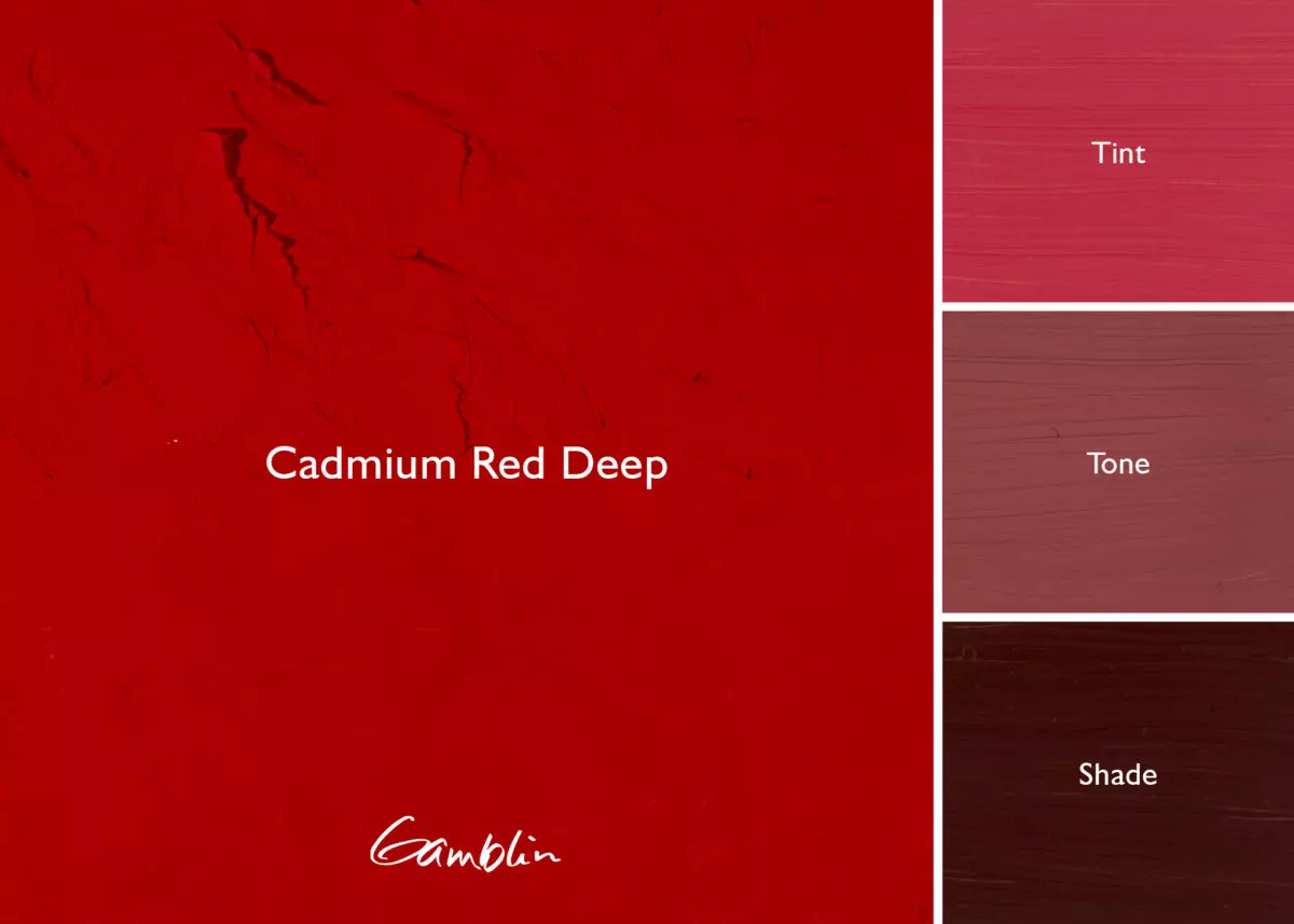
Cadmium Red Deep: Darkest Cadmium Red with very muted tint. Consider Perylene Red if you prefer a brighter tint or mix Perylene Red with the tint of Cadmium Red Deep.
Pigment: Concentrated cadmium sulfo-selenide (PR 108) Vehicle: Alkali refined linseed oil Lightfastness I, Series 5, OPAQUE Color Temperature: Warm SDS
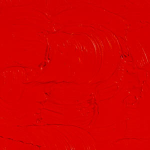
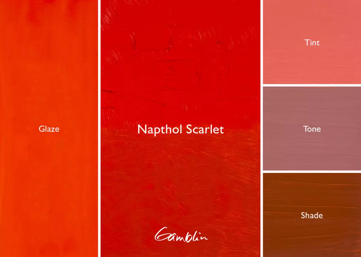
Napthol Red: Modern organic warm red that closely matches Cadmium Red Medium in masstone. Makes more intense tints, more transparent. Excellent for high key painting.
Pigment: Napthol AS-D (PR112) Vehicle: Alkali refined linseed oil Lightfastness II, Series 2, SEMI-TRANSPARENT Color Temperature: Warm SDS
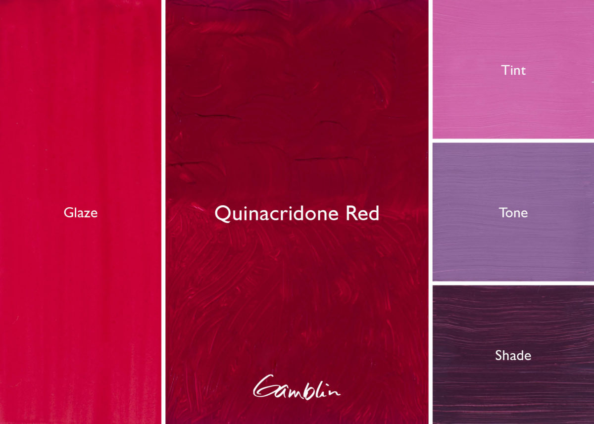
Quinacridone Red: Cool lightfast modern red with high key tint. Useful in place of Alizarin Crimson where more intense masstone and mixtures are desired.
Pigment: Quinacridone red b (PV19) Vehicle: Alkali refined linseed oil Lightfastness I, Series 3, TRANSPARENT Color Temperature: Cool
Because of the value of rare blue pigments, few were mixed to make violets. So painters of the past did not use permanent violet colors. Those made from organic dyes have faded completely away.
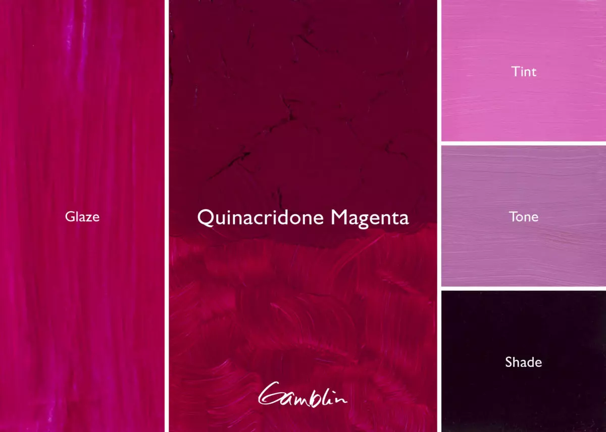
Some painters never buy violet or purple. They mix it using Alizarin Crimson and Ultramarine Blue. While a decent color, the purple mixed using Alizarin Crimson is not lightfast; within 100 years that mixture will not be purple – it will be blue. Try Gamblin’s Alizarin Permanent for mixing with Ultramarine Blue. Or consider making violets with lightfast and transparent Quinacridone Red or Magenta, which will make a permanent purple of much higher chroma.
All single-pigment colors, Gamblin violets each have their own, unique characteristics. Use them to obtain strong, bold purples or to capture the subtle violets in nature.
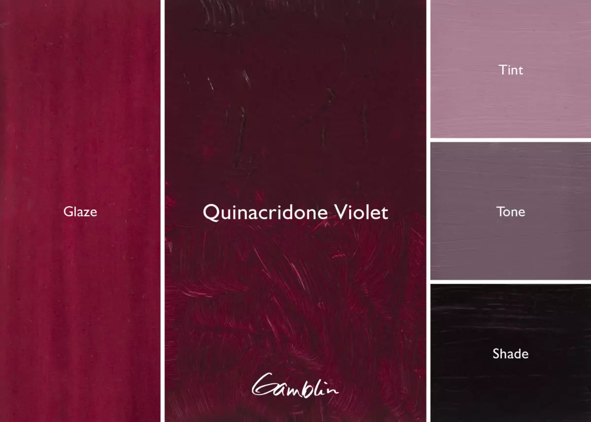
Quinacridone Violet: Robert Gamblin loves violets, which is why he added this strong, clean Quinacridone Violet. More intense than Ultra Violet, warmer than Manganese Violet.
Pigment: Quinacridone Violet (PV 19) Vehicle: Alkali refined linseed oil Lightfastness I, Series 3, TRANSPARENT Color Temperature: Cool SDS
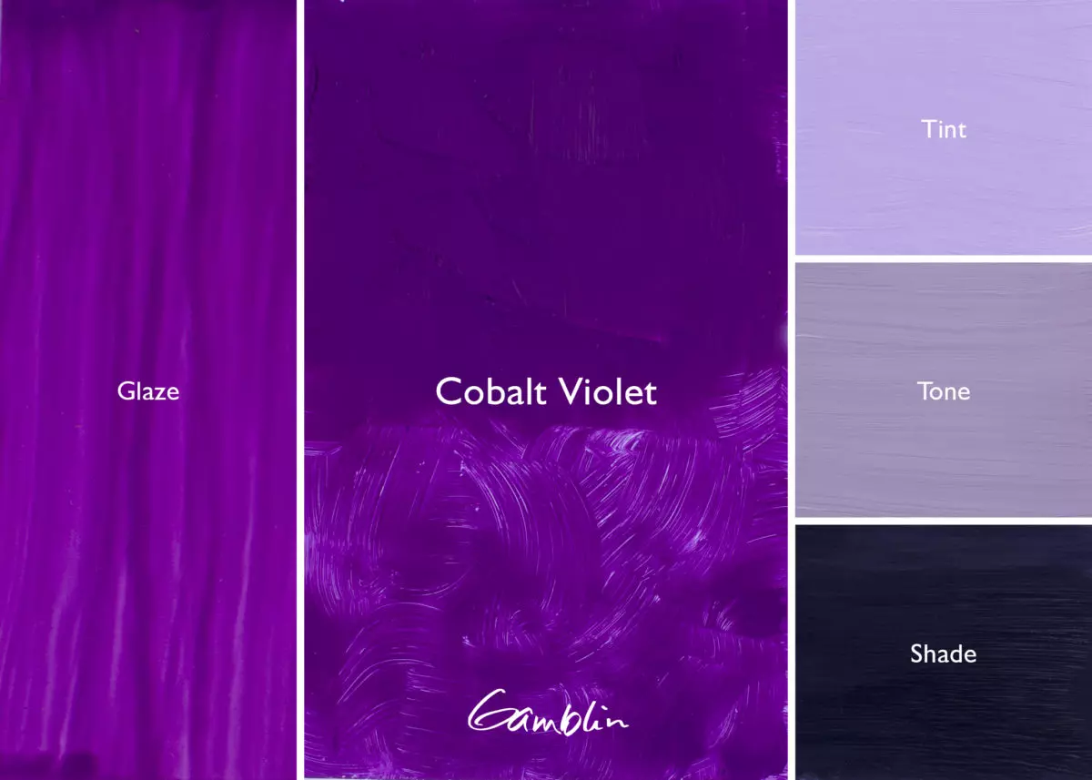
Cobalt Violet: Deep violet that is less red than Manganese Violet, Cobalt Violet is a pure hue that cannot be mixed from other colors. Although very muted in its tint, it is a marvel as a top coat color. Cobalt Violet greys down considerably when mixed with white.
Pigment: Cobalt phosphate (PV 14) Vehicle: Alkali refined linseed oil Lightfastness I, Series 6, SEMI-TRANSPARENT Color Temperature: Warm SDS
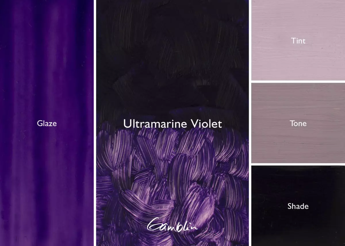
Ultramarine Violet: Mineral color that greys into the colors of the natural world. Warmer than Cobalt Violet, cooler than Manganese Violet and more transparent than either, Ultramarine Violet is one of many specialty pigments made by German chemists during the color revolution of the 19th century.
Pigment: Complex silicate of sodium & aluminum with sulfur (PV 15) Vehicle: Alkali refined linseed oil Lightfastness I, Series 2, TRANSPARENT Color Temperature: Cool SDS
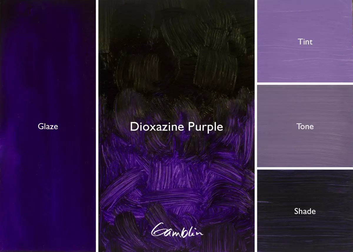
Dioxazine Purple: A cold color with the strongest tinting strength and deepest transparency of all pigments, modern Dioxazine Purple is useful as a high key tint. This purple is so strong that some use it as a black. Dioxazine Purple makes a cold intense tint. Use sparingly.
Pigment: Carbazol dioxazine (PV 23) Vehicle: Alkali refined linseed oil Lightfastness I, Series 2, TRANSPARENT Color Temperature: Cool SDS
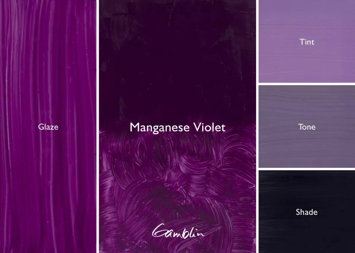
Manganese Violet: A good drying color that makes a natural-looking tint, this warm, reddish, semi-transparent violet is made from the compound manganese phosphate, first discovered in 1868.
Pigment: Manganese ammonium phosphate (PV 16) Vehicle: Alkali refined linseed oil Lightfastness I, Series 3, SEMI-TRANSPARENT Color Temperature: Warm SDS
Owning an oil painting made with expensive blues was once a status symbol. Painters who were poor or didn’t live in cosmopolitan areas never used any blue at all. Jan van Eyck used lapis – but only at the request of his patrons.
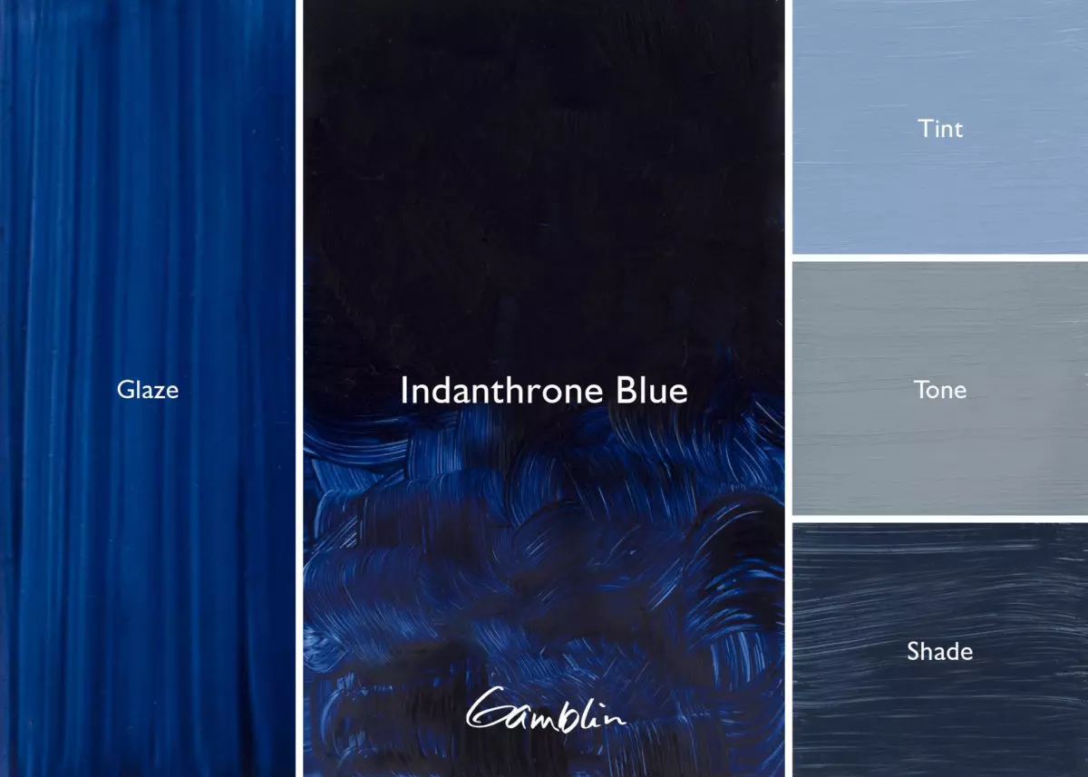
Blue is the most commonly confused color in terms of its hue temperature. There is a widely held misconception that all blues are cool. This is not at all the case: Indanthrone, Cobalt, and Phthalo Blue, for example, are warm, and Ultramarine Blue is so warm that it’s almost purple.
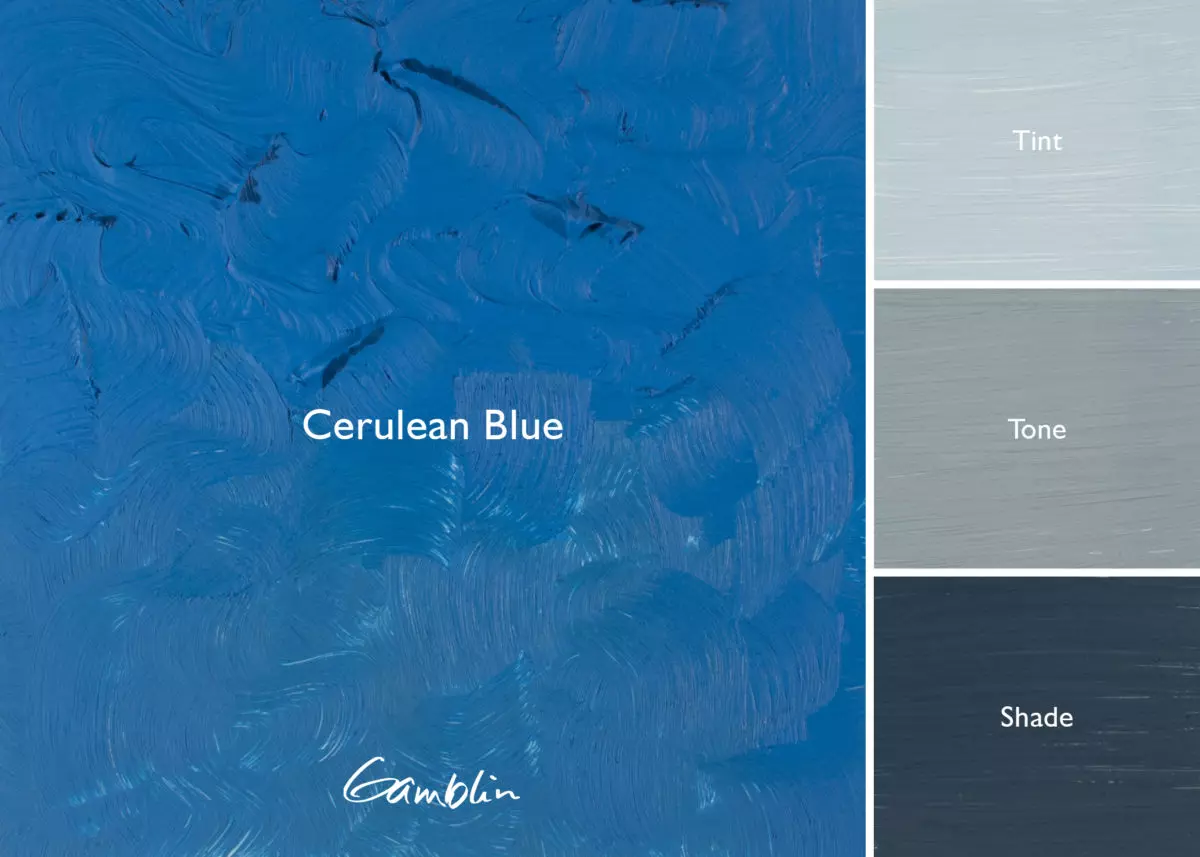
Cerulean Blue: Mixed metal oxide from the early 19th century with an important place on the mineral palette because blues are rarely shifted to the cool, green side, like this one. Very muted in its tint so most valuable as a pure hue.
Pigment: Oxides of cobalt & tin (PB 36) Vehicle: Alkali refined linseed oil Lightfastness I, Series 6, OPAQUE Color Temperature: Cool SDS
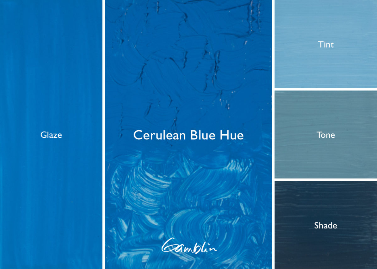
Cerulean Blue Hue: Other Series 2 blues are transparent, so Robert Gamblin formulated this color for painters looking for more opacity at a reasonable price. Cerulean Blue Hue has a higher tinting strength than its namesake.
Pigment: Titanium dioxide, Copper phthalocyanine (PW 6, PB 15:4) Vehicle: Alkali refined linseed oil Lightfastness I, Series 2, OPAQUE Color Temperature: Cool SDS
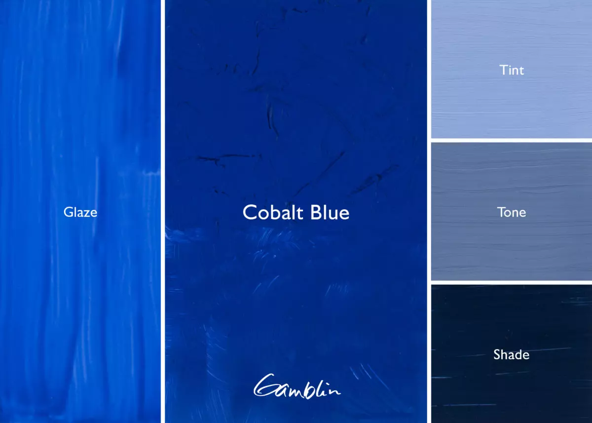
Cobalt Blue: “True blue,” first manufactured in 1804. This color is well worth the price because of its working properties and unique color, which cannot be mixed.
Pigment: Oxides of cobalt & aluminum (PB 28) Vehicle: Alkali refined linseed oil Lightfastness I, Series 5, SEMI-TRANSPARENT Color Temperature: Warm SDS
Manganese Blue Hue: Gamblin’s version is an excellent recreation of the original color, successfully replacing an obsolete pigment. Cool, transparent blue with green undertone; especially useful for painting sky and water.
Pigment: Copper phthalocyanine (PB 15:4) Vehicle: Alkali refined linseed oil Lightfastness I, Series 2, TRANSPARENT Color Temperature: Cool SDS
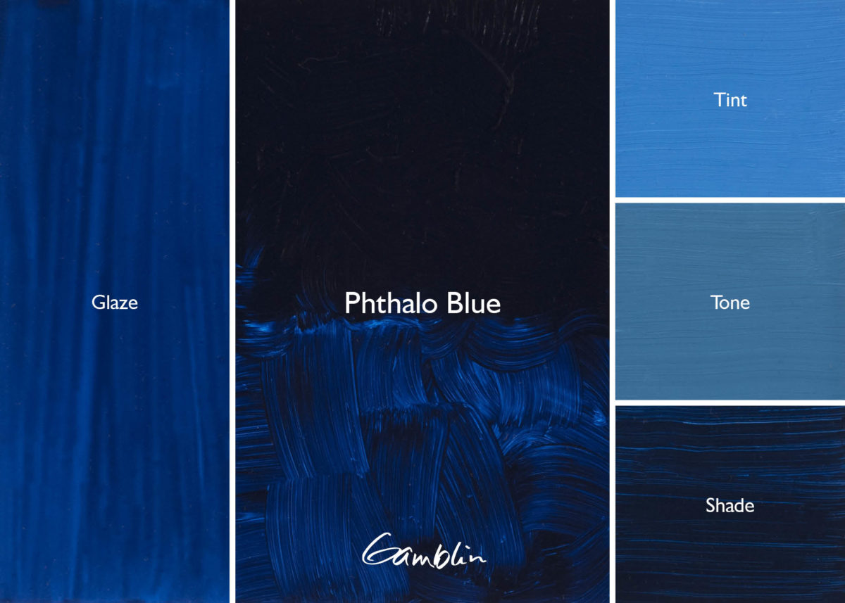
Phthalo Blue: Warm blue first made for printmaking ink (cyan) to replace Prussian Blue in the 1920’s. With clean, pure masstone and transparency, Phthalo Blue, like all modern colors, has high tinting strength.
Pigment: Copper phthalocyanine (PB 15:2) Vehicle: Alkali refined linseed oil Lightfastness I, Series 2, TRANSPARENT Color Temperature: Warm SDS
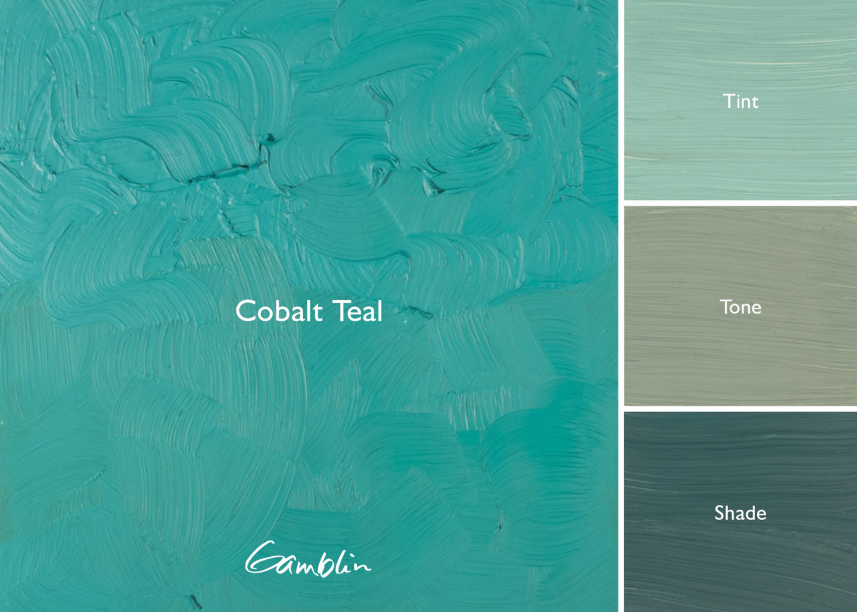
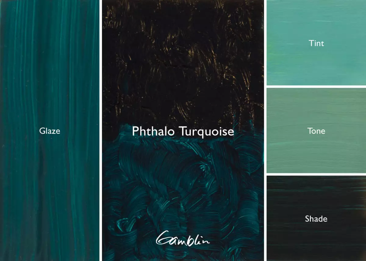
Phthalo Turquoise: Perfect marriage of blue and green, this transparent turquoise has high tinting strength and makes a high key tint. Excellent for painting tropical water.
Pigment: Copper phthalocyanine, chlorinated copper phthalocyanine (PB15:2, PG 7) Vehicle: Alkali refined linseed oil Lightfastness I, Series 2, TRANSPARENT Color Temperature: Cool SDS
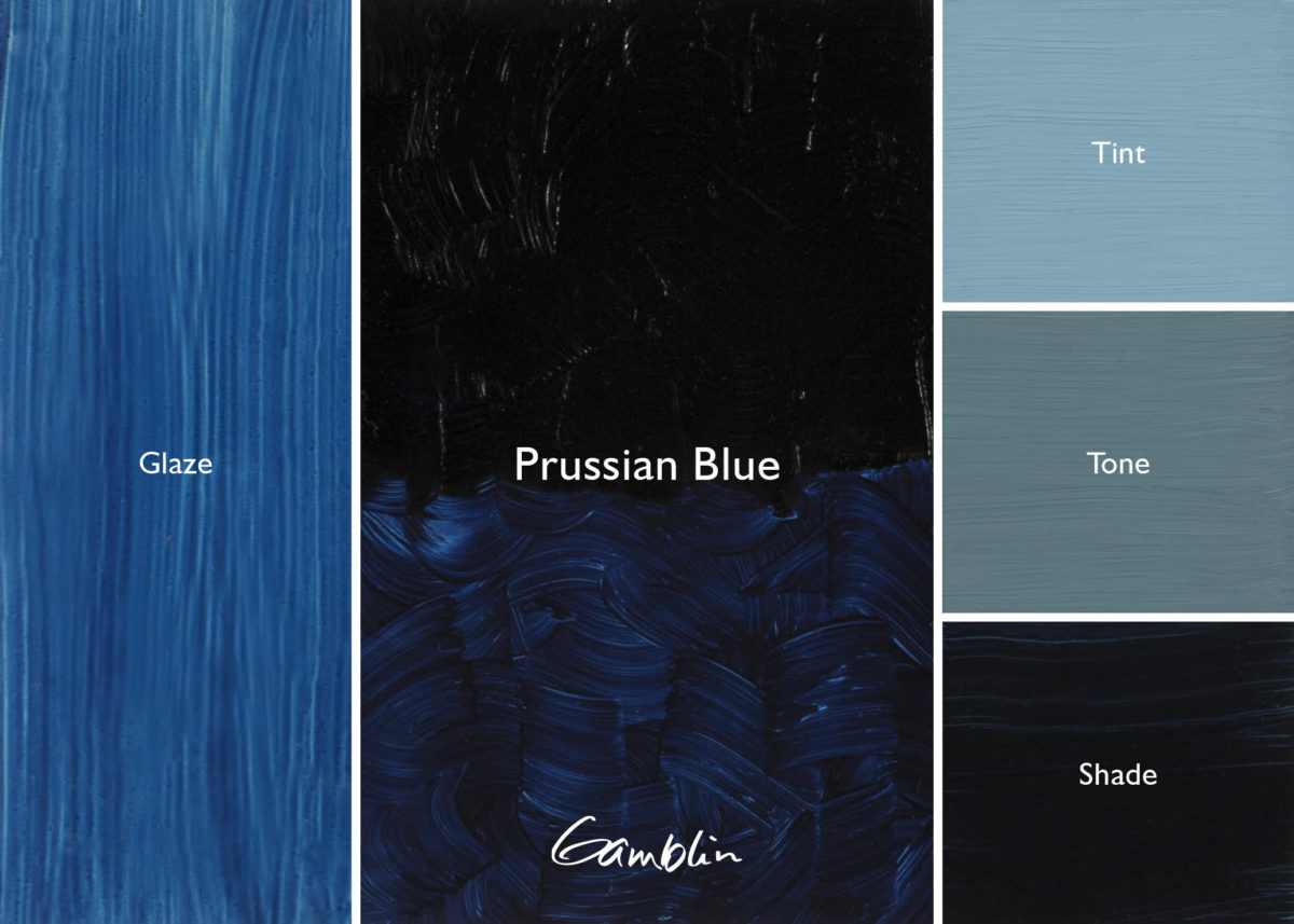
Prussian Blue: First synthetic color of the Industrial Revolution, discovered by accident in 1704 while a chemist was trying to formulate artificial crimson. Cool blue with more muted tint than Phthalo Blue. It has a high tinting strength, is lightfast, and is especially beautiful in its transparency.
Pigment: Ferri-ammonium ferrocyanide (PB 27:1) Vehicle: Alkali refined linseed oil Lightfastness I, Series 2, SEMI-TRANSPARENT Color Temperature: Cool
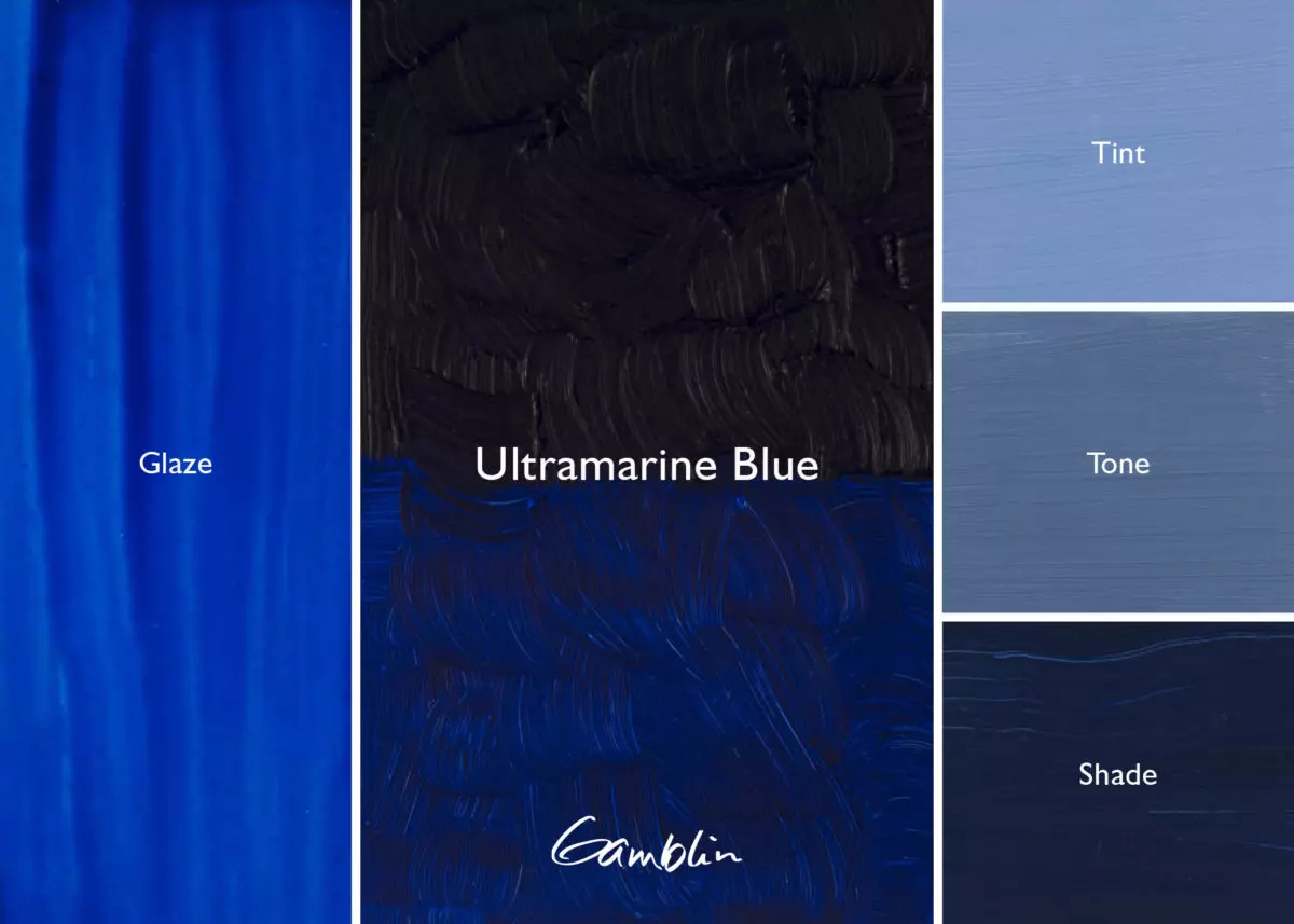
Ultramarine Blue: A great glazing color, warm Ultramarine Blue is one of the few mineral colors that is completely transparent. Lightfast with moderate tinting strength. Consider using Alizarin Permanent instead of Alizarin Crimson to mix violets.
Pigment: Complex silicate of sodium & aluminum with sulfur (PB 29) Vehicle: Alkali refined linseed oil Lightfastness I, Series 2, TRANSPARENT Color Temperature: Warm SDS
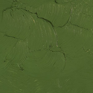
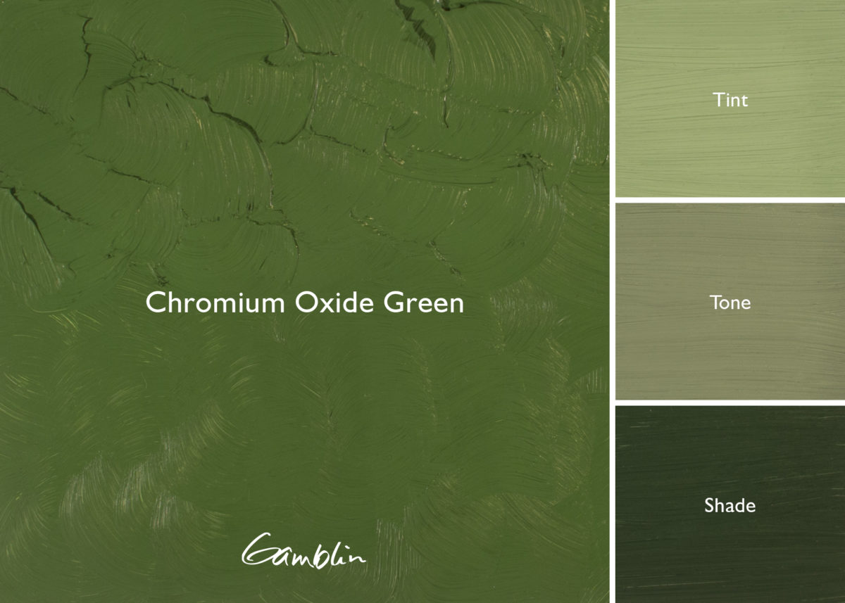
Since most greens in the natural world have a high degree of yellow in them, painters will appreciate the yellowy warmth of Phthalo Emerald while beautifully transparent Phthalo Green serves as the cooler or blue shade. Either Phthalo Green, completely lightfast with an extraordinary tinting strength, or Phthalo Emerald can be used to “boost” mineral colors in tints.
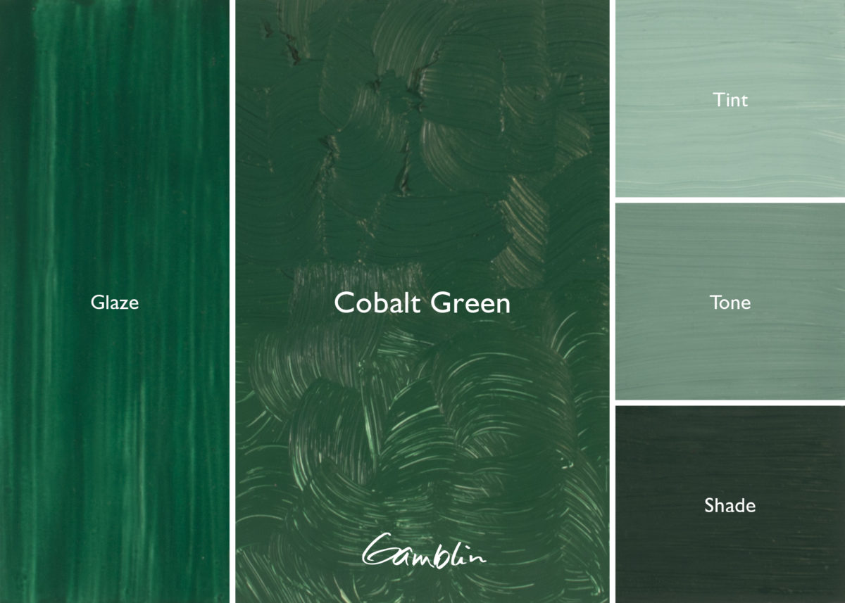
Cobalt Green, made from a compound of oxides of cobalt and zinc, found favor with 19th century landscape painters after 1856. Cobalt Green makes valuable greys and is especially effective for painting the American Southwest, where green should be kept to a muted minimum.
Cobalt Green: An undervalued cool green with moderate masstone and very muted tint. No combination of blue and yellow will yield this unusual color of the American Southwest.
Pigment: Oxides of cobalt and zinc (PG 19) Vehicle: Alkali refined linseed oil Lightfastness I, Series 4, SEMI-TRANSPARENT Color Temperature: Cool SDS
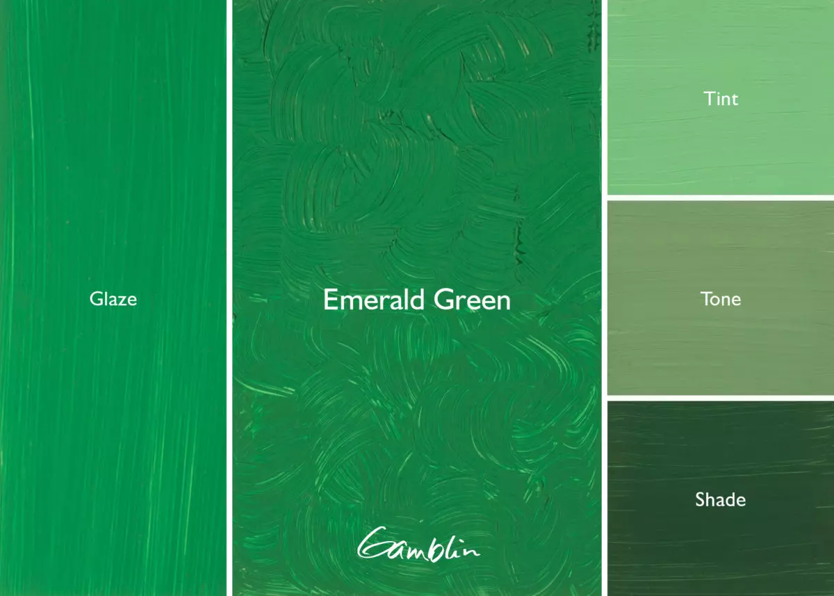
Emerald Green: An important color for painters who prefer the direct painting techniques of the Impressionists. This mixed color replaces the toxic arsenic-based original.
Pigment: Chlorinated and bromated copper phthalocyanine, titanium dioxide, arylide yellow (PG36, PW6, PY74) Vehicle: Alkali refined linseed oil Lightfastness I, Series 2, SEMI-TRANSPARENT Color Temperature: Warm SDS
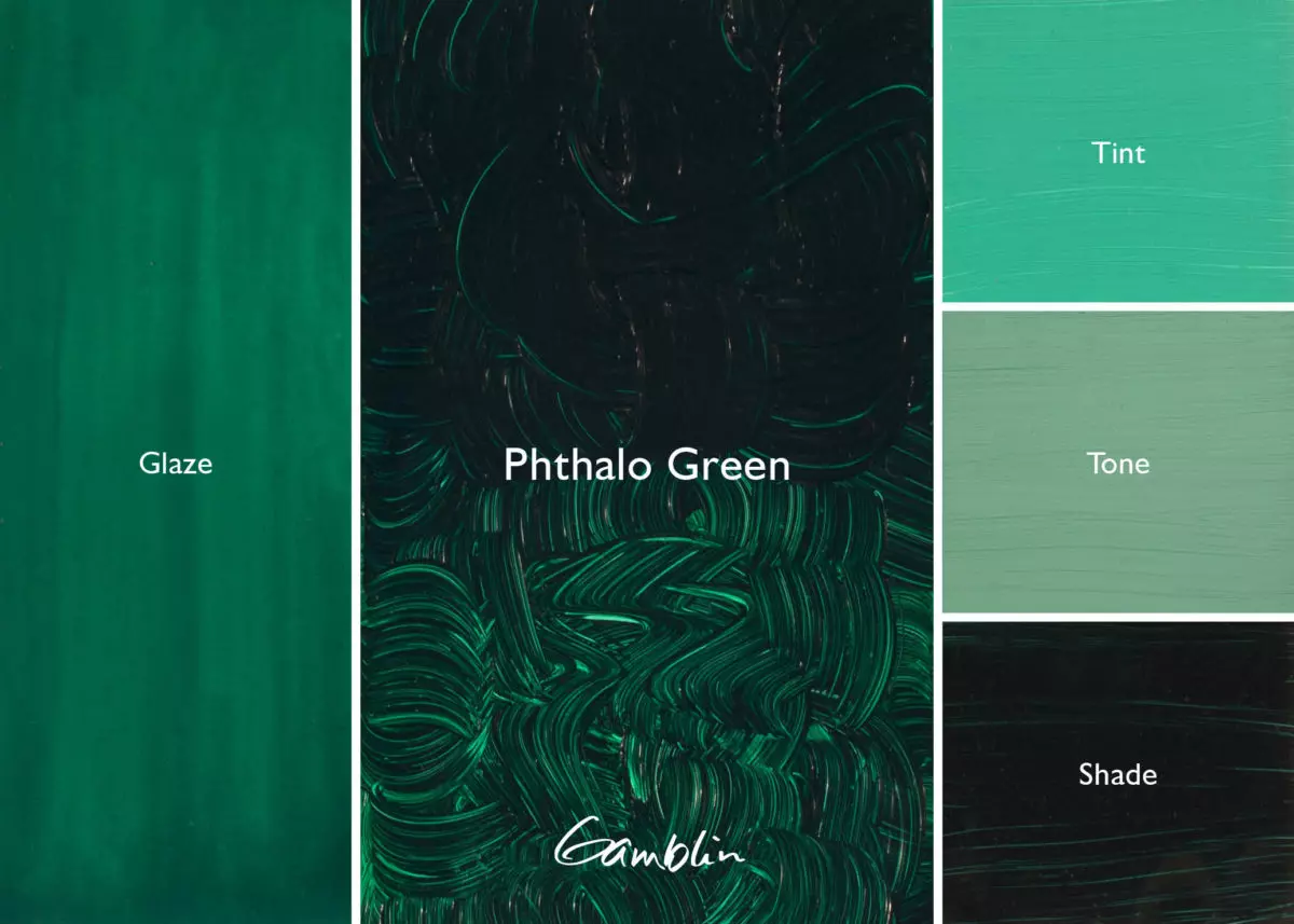
Phthalo Green: A dark bluish green more closely resembles Verdigris than Viridian. First manufactured in 1927, Phthalo Green has a very high tinting strength and transparency. Consider using Phthalo Emerald, a warmer and more natural-looking color.
Pigment: Chlorinated copper phthalocyanine (PG 7) Vehicle: Alkali refined linseed oil Lightfastness I, Series 2, TRANSPARENT Color Temperature: Cool SDS
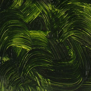
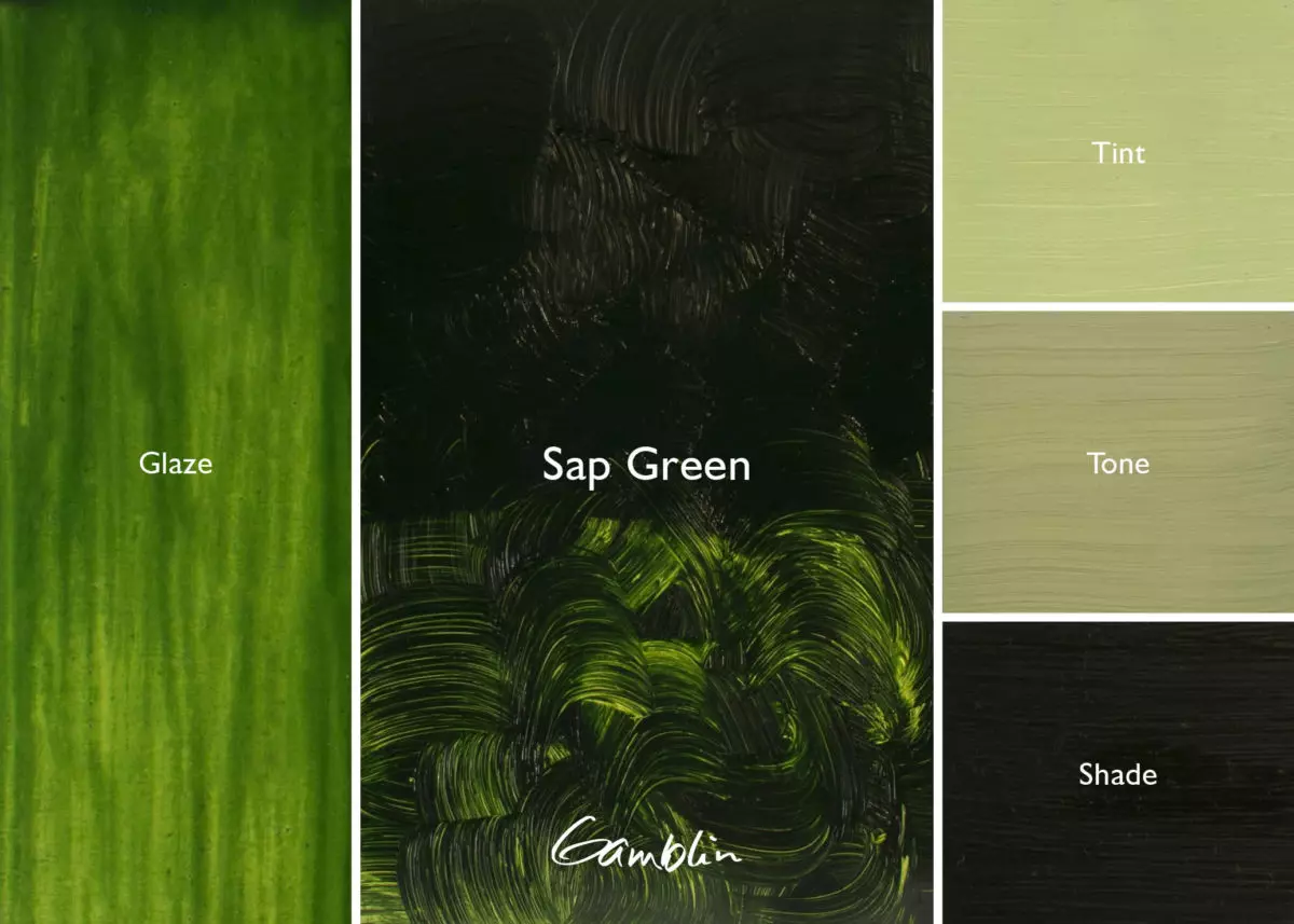
Sap Green: Originally made from berries, this true lightfast color is a predictable mixture that can be easily warmed with Hansa Yellows or cooled with blues.
Pigment: Diarylide yellow, copper phthalocyanine (PY 83, PB 15:2) Vehicle: Alkali refined linseed oil Lightfastness I, Series 2, TRANSPARENT Color Temperature: Warm SDS
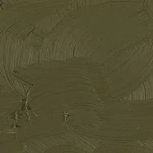
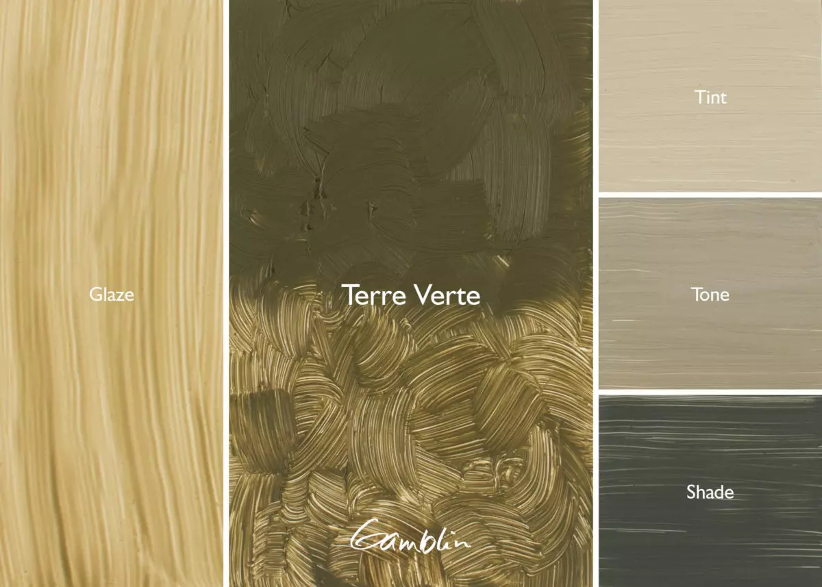
Terre Verte: Historically used as a bole for gilding and as underpainting for flesh tones in Medieval painting (verdaccio), Terre Verte, or green earth, was made from volcanic celadonite and/or a mineral of sedimentary origin; Robert Gamblin mixed this color because true natural green earth pigment is unpredictable in color and availability.
Gamblin Terre Verte is an excellent color for grisaille; it has a weak masstone and very muted tint.
Pigment: PBr7, PG18 Vehicle: Alkali refined linseed oil Lightfastness I, Series 2, TRANSPARENT Color Temperature: Warm SDS
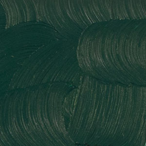
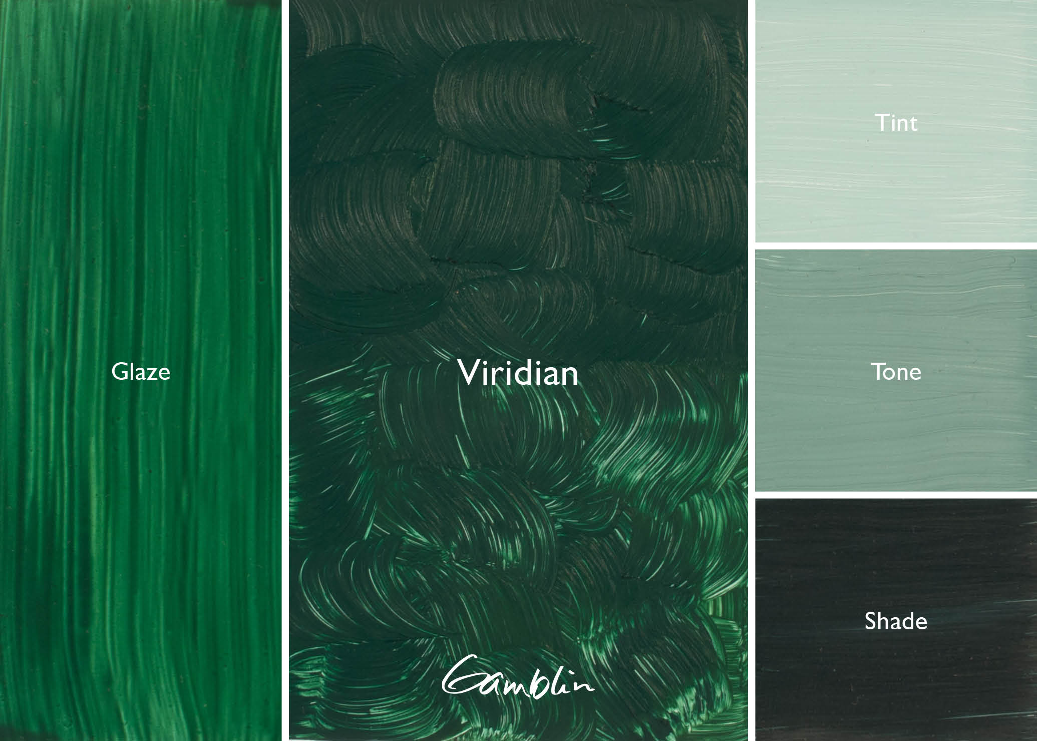
Viridian: First synthesized in 1859, non-toxic Viridian replaced Verdigris and Emerald Green as a glazing color by the turn of the 20th century. It has good tinting strength and a muted tint like colors of the natural world.
Pigment: Hydrated chromium oxide (PG 18) Vehicle: Alkali refined linseed oil Lightfastness I, Series 4, TRANSPARENT Color Temperature: Cool
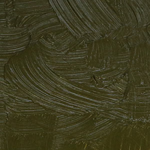
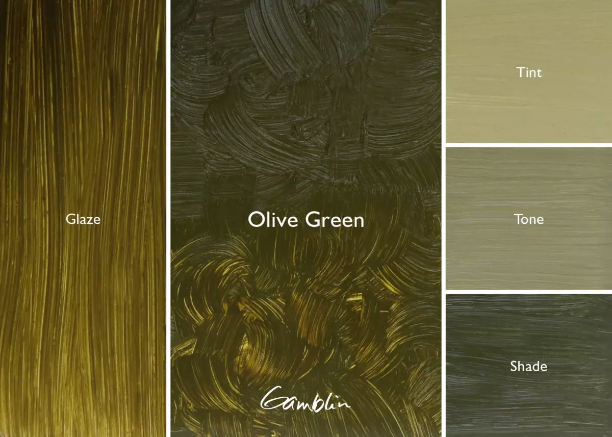
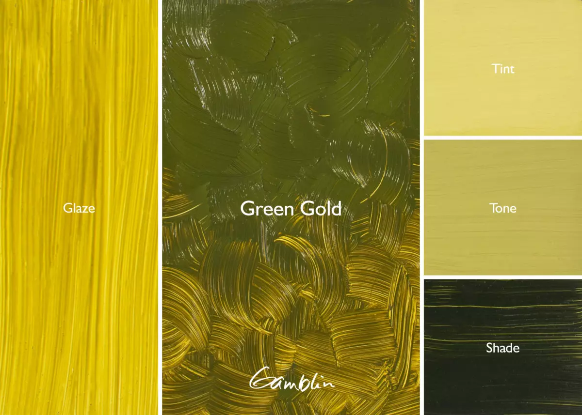
Green Gold: For a modern pigment, Green Gold has a fairly muted, olive green masstone. Its most interesting quality is its warm, glowing transparency. Excellent for glazing. High tinting strength.
Pigment: Azomethine Yellow 56 (PY 129) Vehicle: Alkali refined linseed oil Lightfastness I, Series 4, SEMI-TRANSPARENT Color Temperature: Warm SDS
Old Masters’ paintings were mostly brown because earth colors were the only lightfast pigments available. Found all over the earth in various shades of brown and muted shades of red, orange, yellow and green, earth colors have been on artists’ palettes for more than 40,000 years.
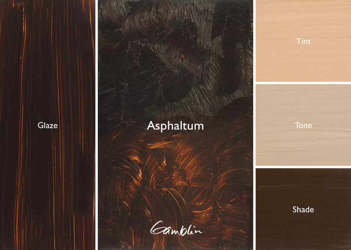
At the special request of Nathan Olivera, Robert Gamblin formulated a contemporary version of Asphaltum that is true to its historic working properties but, unlike traditional formulations, is both lightfast and permanent. Gamblin’s version, much to Olivera’s delight, captures not only Asphaltum’s qualities but also its “earth energy.”
In the studios of the Old Masters, painters pushed against the limitations of their colors. Sienna and Umber are key colors in creating effects of depth like Caravaggio’s chiaroscuro or Leonardo’s sfumato with its almost imperceptible transitions from light to dark. The famous “Terra di Siena” is a hydrated iron oxide from Tuscany. It contains silicates and aluminates that increase the transparency of the pigment.
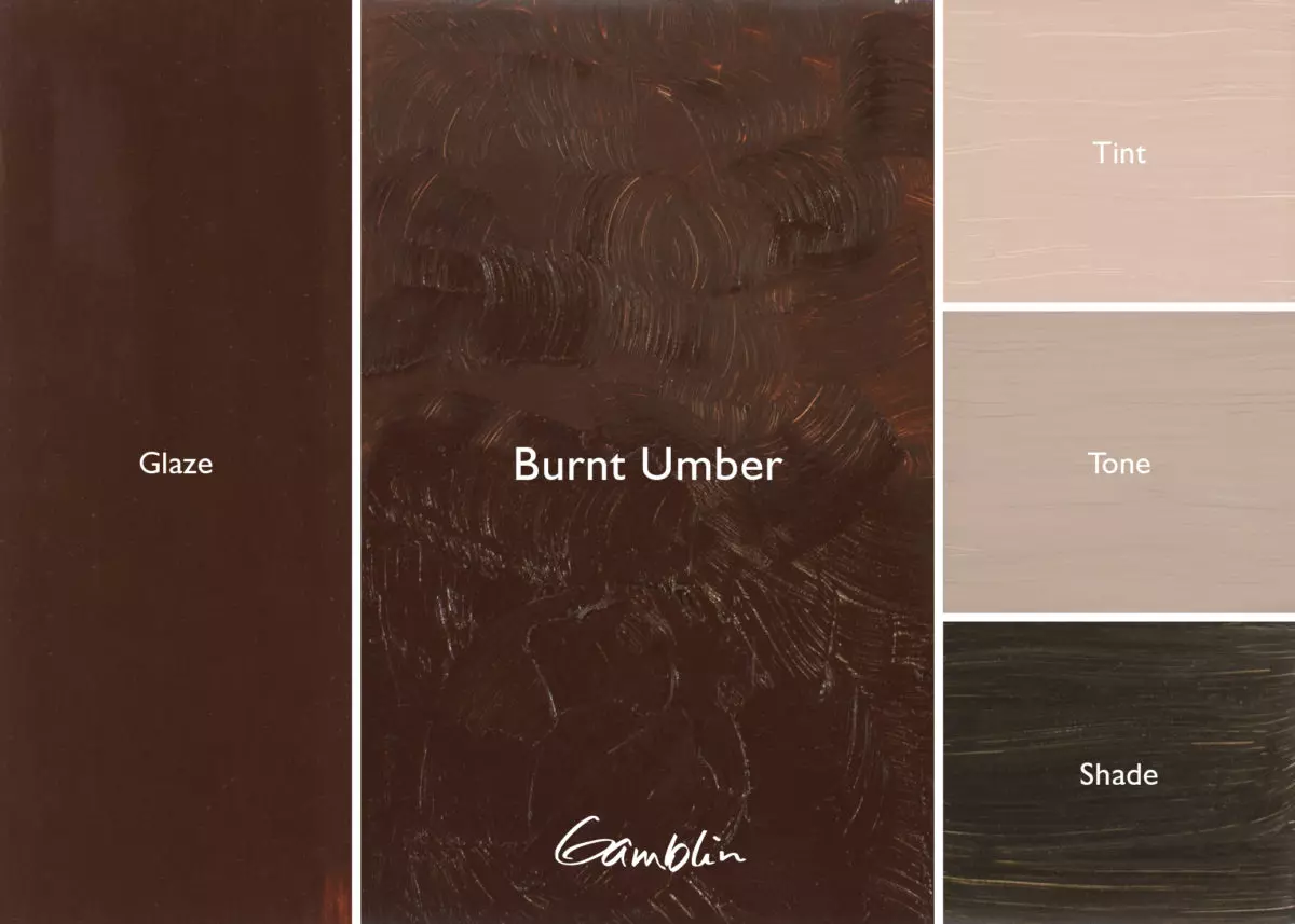
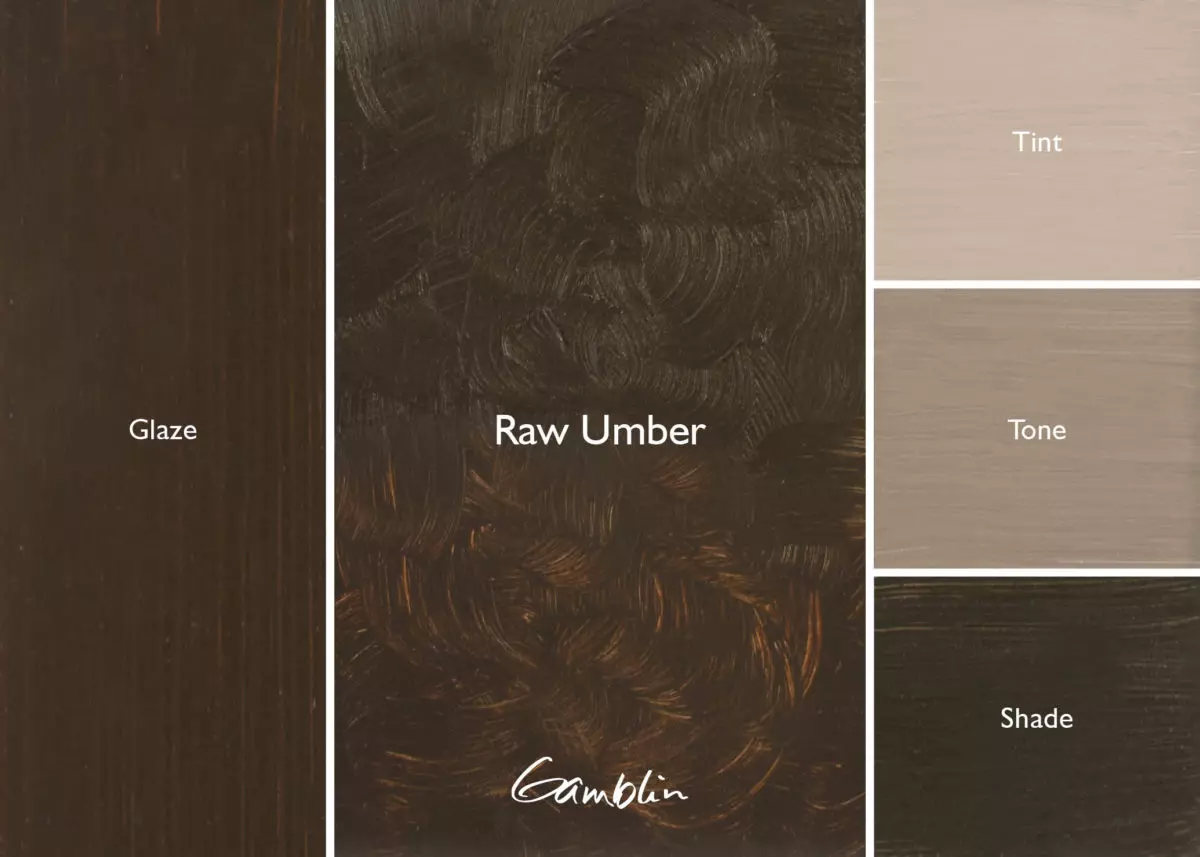
Umber is found in sites where naturally occurring manganese dioxide combines with iron. Umbers and other pigments containing manganese make quick-drying oil colors. Burnt Sienna and Burnt Umber are made by roasting earth pigments until the desired reddish colors are produced.
Natural earth pigments often have uneven color and must be washed and processed into small particle sizes. This labor-intensive processing led to a demand for synthetic iron oxides that were developed as Mars colors in the late 18th century.
There is some discussion about why synthetic iron oxides were first produced, especially when so much pigment was then available in earth mines. The most logical explanation is commercial painters demanded consistency in color and texture for the emerging house paint industry. The British started to build homes with wood but they still wanted their houses to look like brick. Also, through the manufacturing process, shades can be changed. “Mars” was an internationally recognized word for iron.
A hundred years after the Masters’ great era, there was a revival in their techniques. Asphaltum was used when painters wanted to artificially age their painting to make them look like an Old Master could have painted them. Organic in nature, the original Asphaltum was coal black and crumbly. The pigment was not ground into oil but rather melted into oil and turpentine. Among the few transparent earth colors, Asphaltum was used in glazing and shading. But by the end of the 18th century, painters were dissuaded from using the color because it caused paintings to fade and deteriorate at an alarming rate.
Two hundred years later, painters’ interests have turned again toward the techniques of Renaissance masters. Like their predecessors, contemporary painters are pushing against the limitations of their colors. Often painters ask if earth colors are less transparent today than hundreds of years ago. The answer is YES. Today’s earth pigments are more opaque because the once rich deposits in Siena, Corsica and Cyprus are nearly mined out. Today’s earth colors must be mined from various locations and mixed together to achieve consistent colors. The bulk of earth pigments are used to color concrete for stucco and other building materials. The result is a rise in cost and a decline in transparency.
The late 20th century has produced the first significant change in iron oxides with the invention of transparent Mars colors for the automobile industry. These colors are made by hydrating earth colors, a process by which opaque colors are made transparent. As painters we have come full circle. The prized transparent earth reds of antiquity have returned to our palettes.
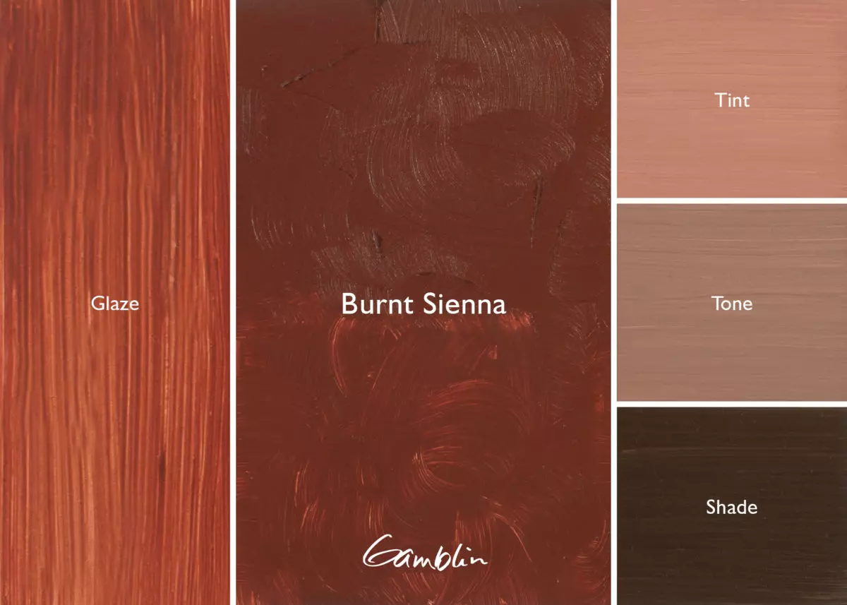
Burnt Sienna: Natural calcined (roasted) earth pigment. More opaque today than 200 years ago. For greater transparency, consider Gamblin Transparent Earth Colors and Van Dyke Brown.
Pigment: Calcined natural iron oxide (PBr 7) Vehicle: Alkali refined linseed oil Lightfastness I, Series 1, SEMI-TRANSPARENT Color Temperature: Warm SDS
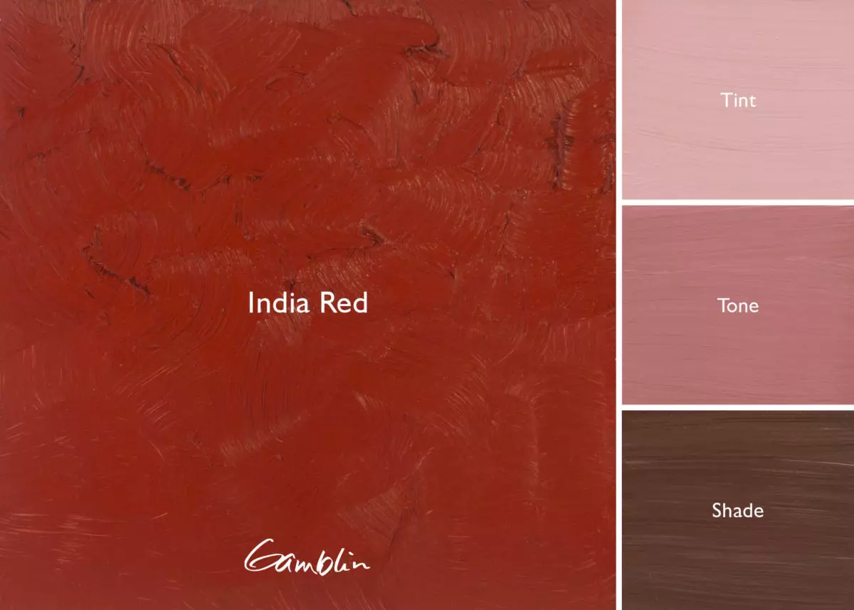
India Red: Originally a natural, more purple iron oxide imported from India. First synthesized in the 18th century as a “Mars” color, contemporary India Red is very dense purplish red with great hiding power.
Pigment: Synthetic red iron oxide (bluish shade) (PR 101) Vehicle: Alkali refined linseed oil Lightfastness I, Series 1, OPAQUE Color Temperature: Warm SDS
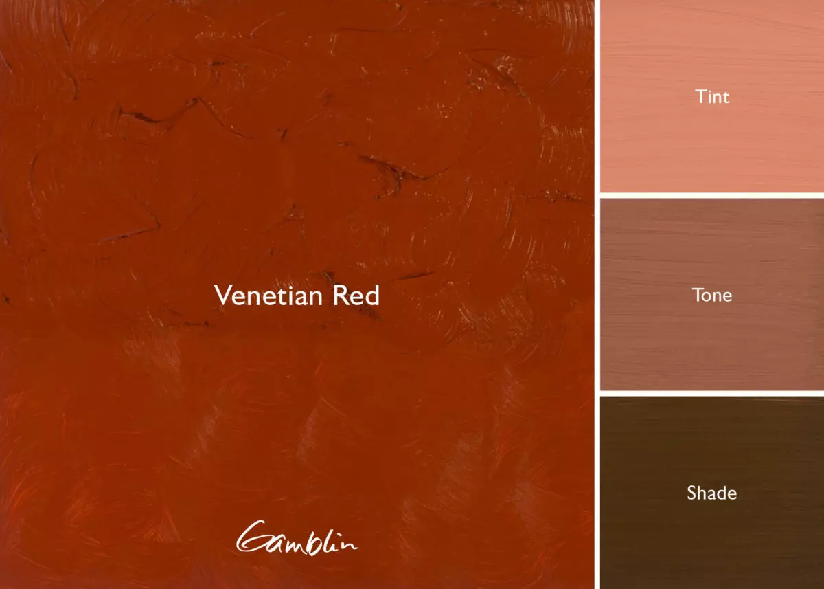
Venetian Red: (formerly called Iron Red Light) Also a Mars Color, Venetian Red is lighter, more of a brick red. Dense, with great hiding power.
Pigment: Synthetic red iron oxide (yellowish shade) (PR 101) Vehicle: Alkali refined linseed oil Lightfastness I, Series 1, OPAQUE Color Temperature: Warm SDS
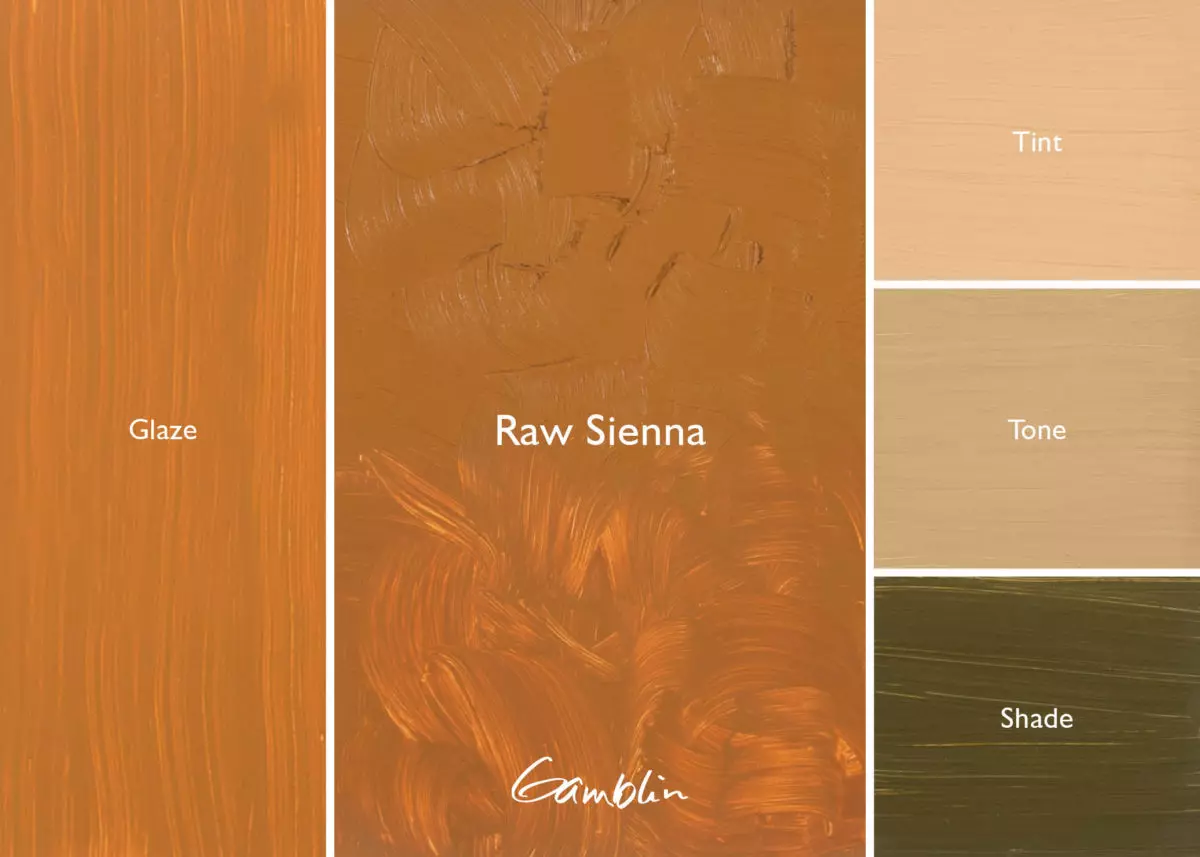
Raw Sienna: Traditional earth yellow glazing color, originally mined in Tuscany. Consider using Gamblin Transparent Earth Yellow for more transparency.
Pigment: Natural iron oxide (PBr 7), Vehicle: Alkali refined linseed oil Lightfastness I, Series 1, SEMI-TRANSPARENT Color Temperature: Warm SDS
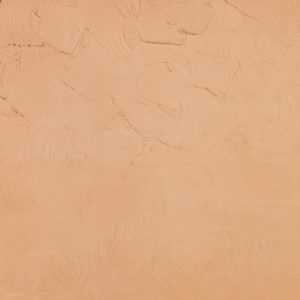
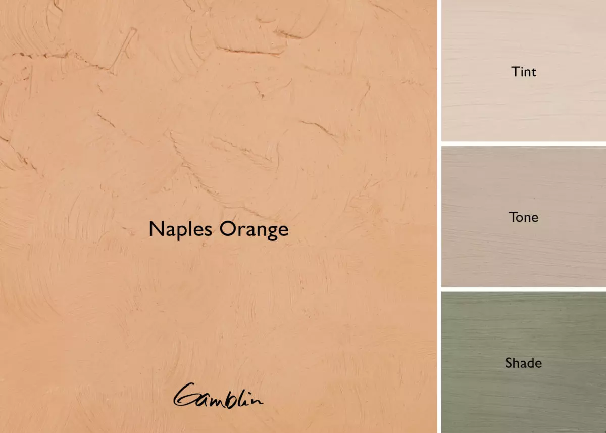
Naples Orange: This color is very versatile. Like Naples Yellow, it can be used as a very warm white, this one being even warmer. And since its color intensity is moderate, Naples Orange is especially useful for portrait and figure painting, landscape painting, and abstract work.
Pigment: Titanium dioxide, natural hydrated iron oxide, napthol AS-OL (PW6, PY43, PR188) Vehicle: Alkali refined linseed oil Lightfastness I, Series 2, OPAQUE Color Temperature: Warm SDS
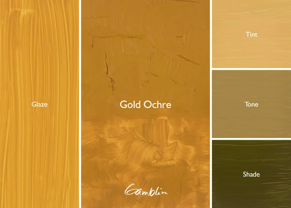
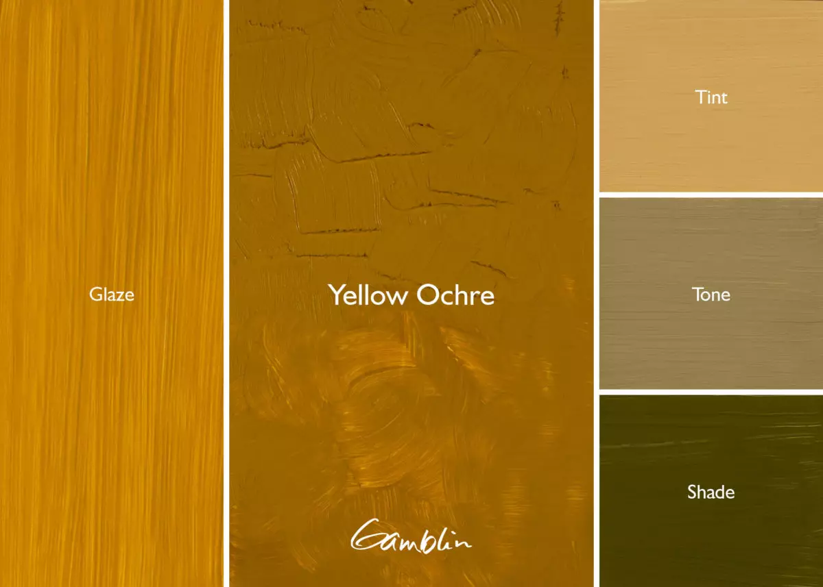
Yellow Ochre: This modest, yet valuable earth color has been on painters’ palettes since painting began. Pure, hydrated yellow iron oxide (goethite). Indispensable for naturalistic color-mixing.
Pigment: Natural hydrated iron oxide (PY43) Vehicle: Alkali refined linseed oil Lightfastness I, Series 1, SEMI-TRANSPARENT Color Temperature: Warm
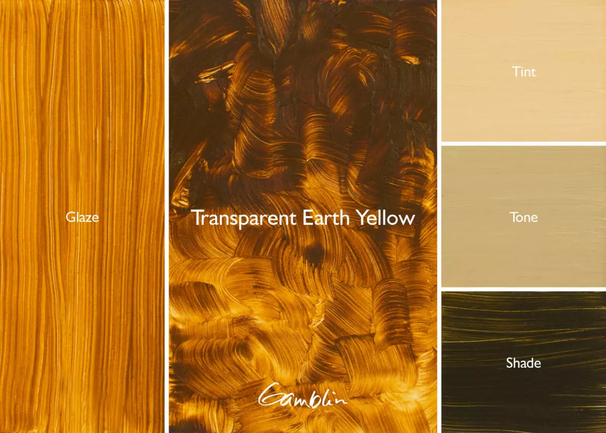
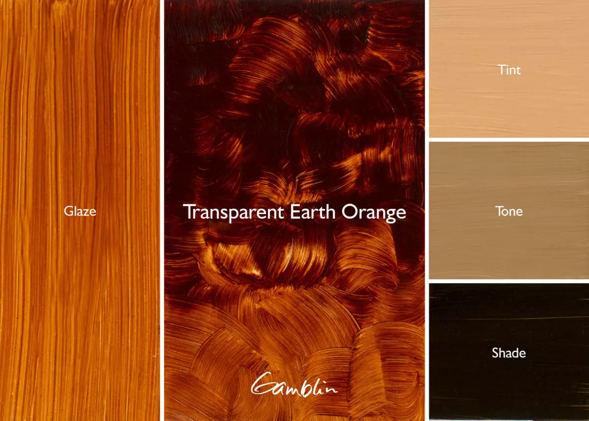
Transparent Earth Orange: A color prized by contemporary masters, this is a truly transparent version of Burnt Sienna. These new hydrated Mars colors give painters more clarity in transparency and higher tinting strength. Excellent for glazing.
Pigment: Transparent Mars Yellow, Transparent Mars Red (PY 42, PR 101) Vehicle: Alkali refined linseed oil Lightfastness I, Series 3, TRANSPARENT Color Temperature: Warm SDS
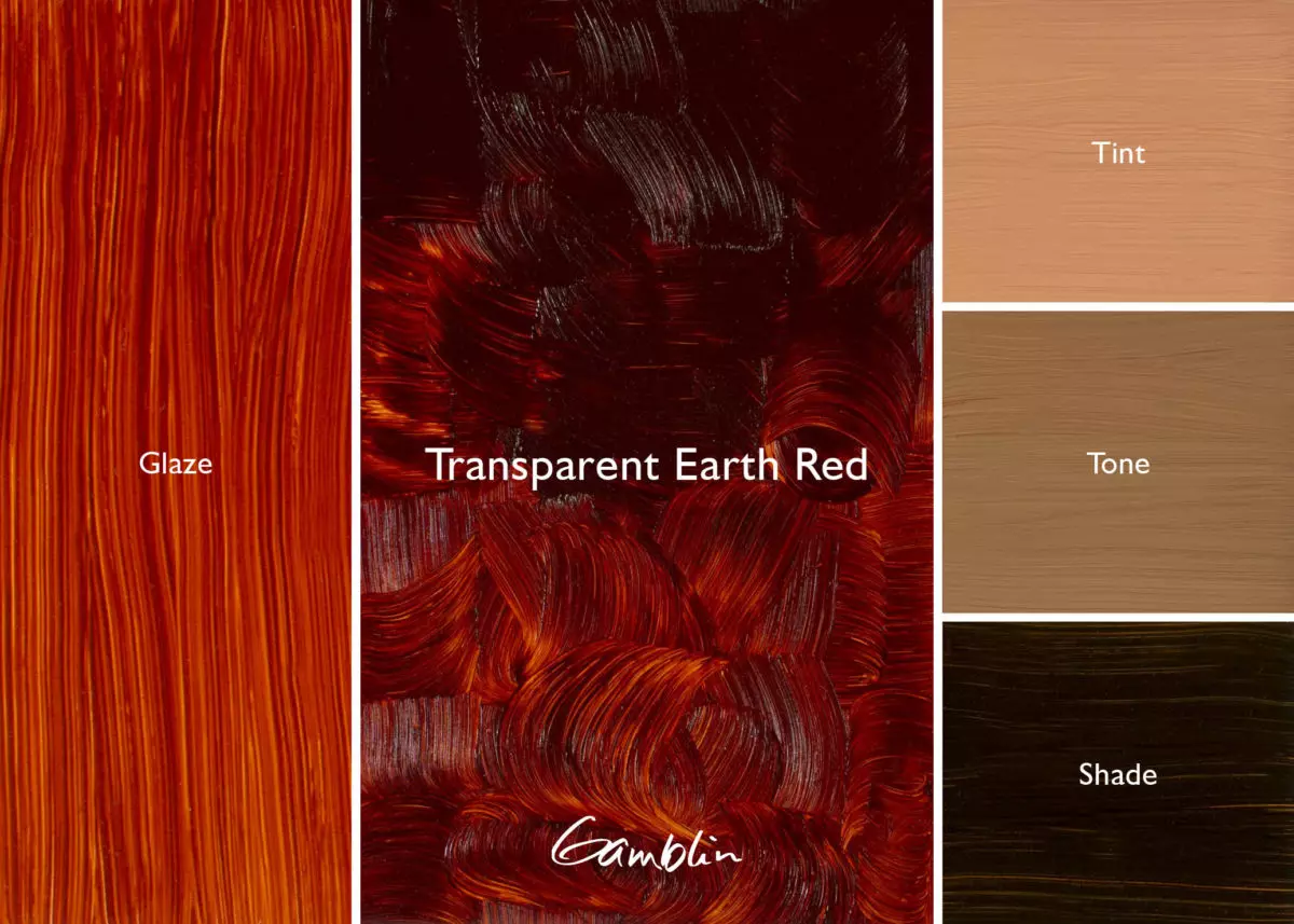
Transparent Earth Red: This is a truly transparent version of Venetian Red. Add a small measure of a cool red like Alizarin Permanent or Dioxazine Purple to adjust color for India Red.
Pigment: Transparent Mars Red (PR 101) Vehicle: Alkali refined linseed oil Lightfastness I, Series 3, TRANSPARENT Color Temperature: Warm SDS
Asphaltum: A transparent brownish-black. One of the most popular colors of the 18th century recreated by Robert Gamblin, whose version is true to historic working properties – but lightfast and permanent.
Pigment: PR101, PB29 Vehicle: Alkali refined linseed oil Lightfastness I, Series 3, TRANSPARENT Color Temperature: Warm SDS
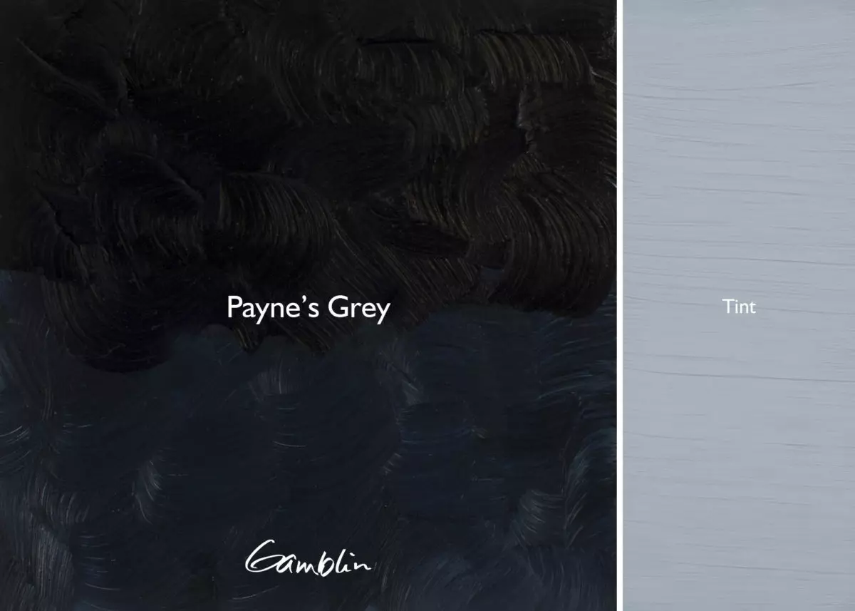
At least since the time of the Neo-Impressionists there has been a controversy about making greys. Thinking greys made from black are lifeless, some painters never allow black on their palettes; they only make greys from complements.
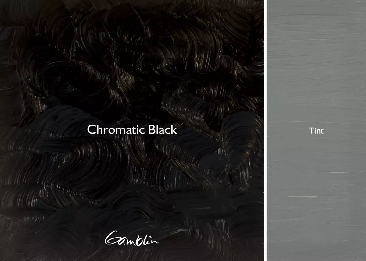
While overusing black in a painting will make it look dirty, neutral greys made from black and white are the same as neutral greys made from exact complements. Greys made from complements are more lively because they are incomplete mixtures of one color next to another. So come back to black with Gamblin Chromatic Black, a neutral, tinting black made from complementary colors.
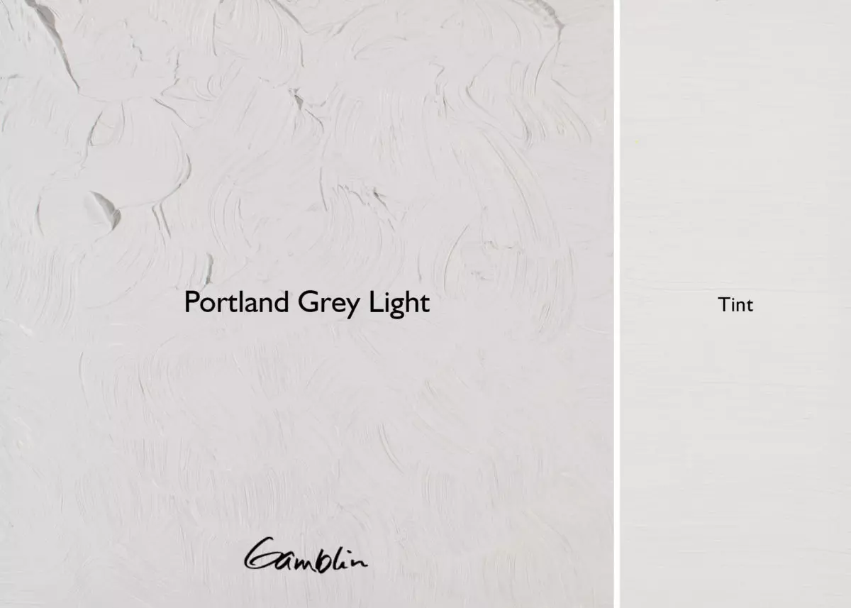
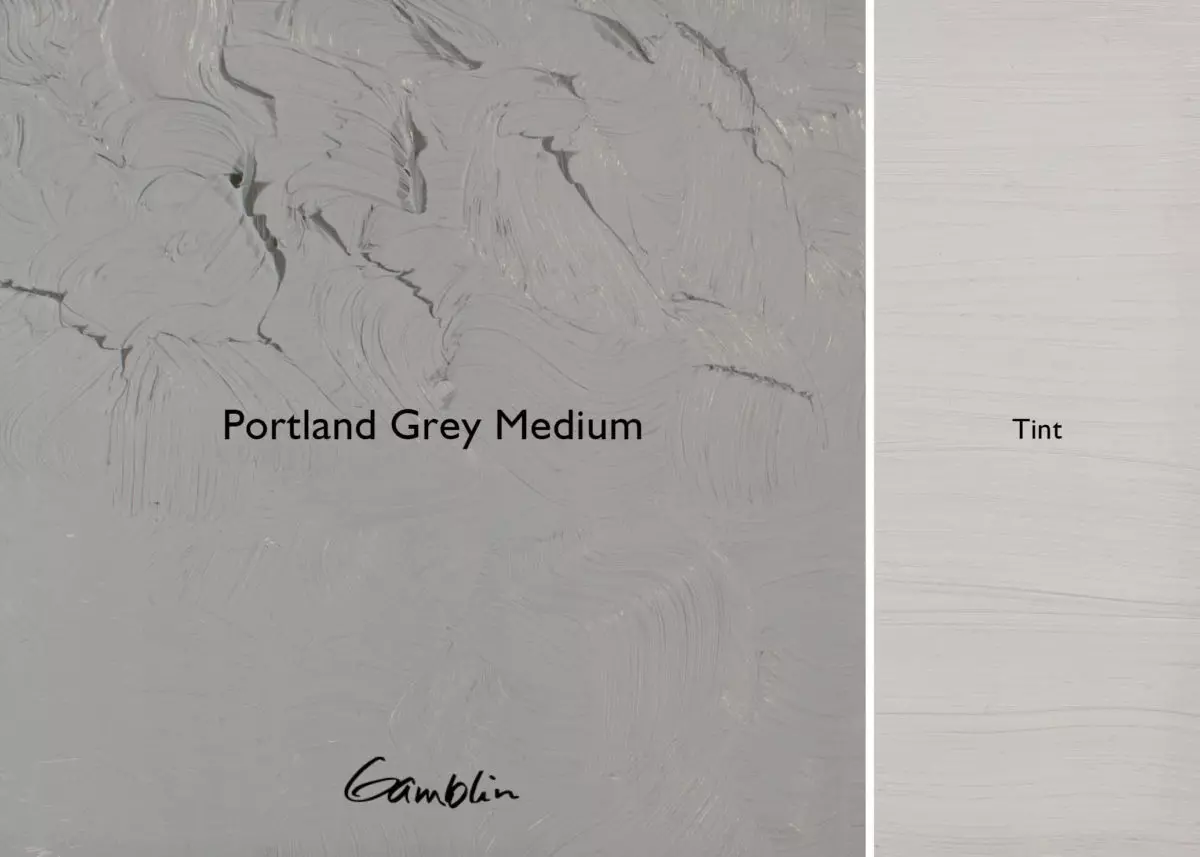
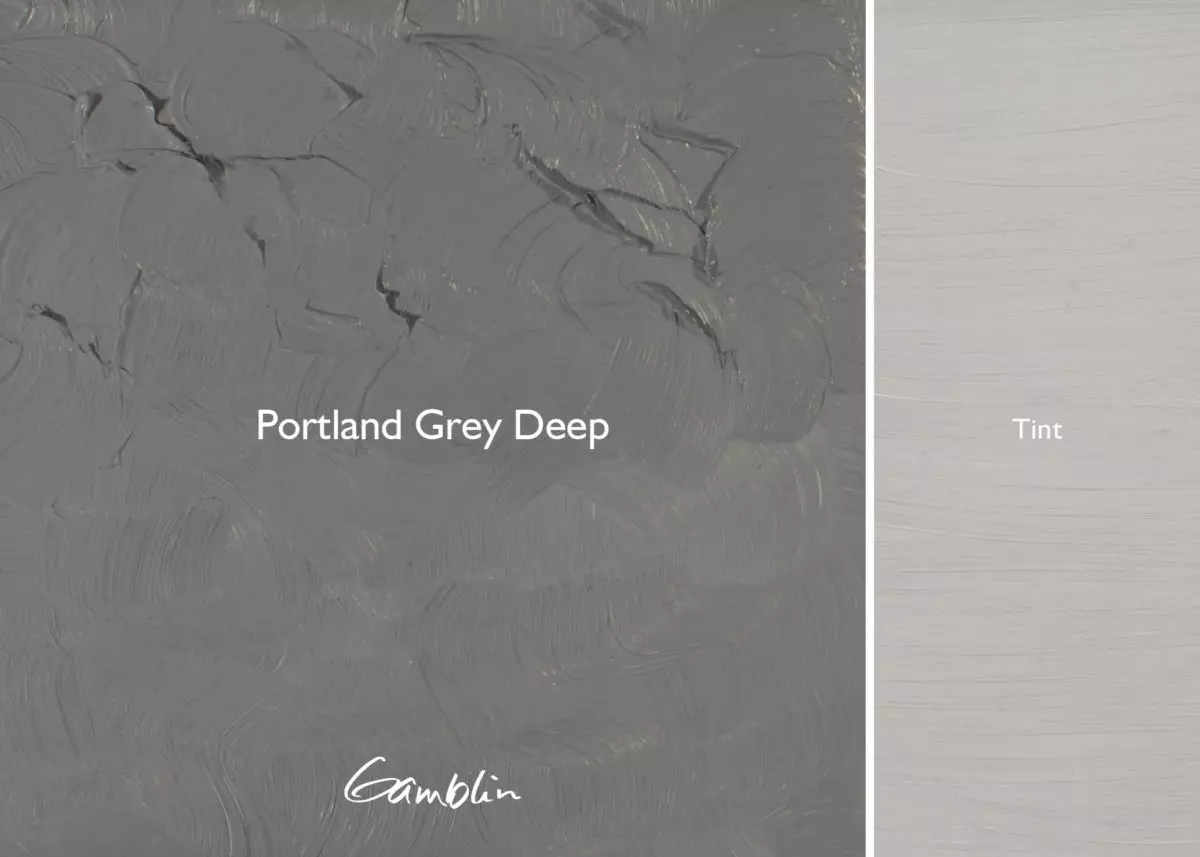
An interesting alternative to mixing with white, the Portland Greys quickly lower the intensity of a color without changing its Munsell value.
Our range of Portland Greys is expanded with Portland Warm Grey and Portland Cool Grey. A triad of muted primary colors is created when Titanium Buff is added to these. This gives painters the ability to complete a range of “colored greys” for nuanced color mixing.
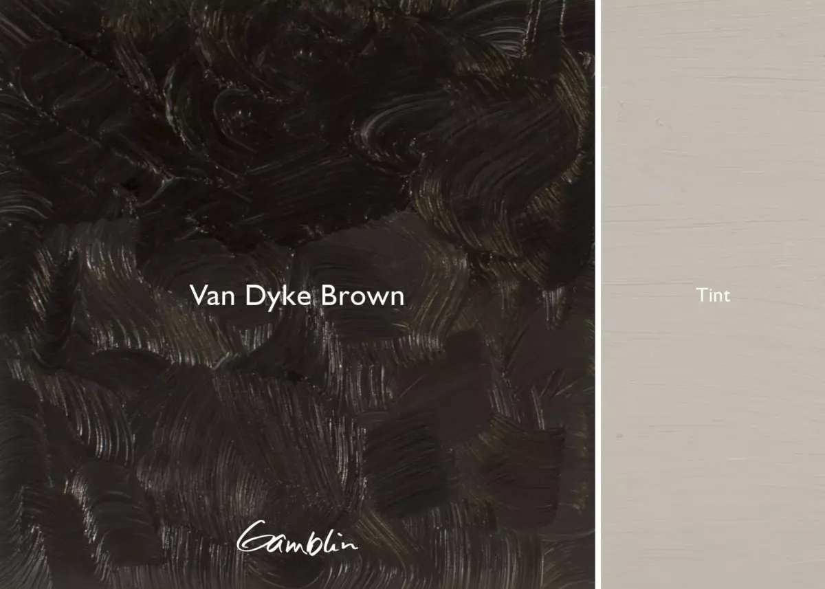
Van Dyke Brown: Warmest Gamblin black. Good glazing color and useful for adding “gallery tone.” Completely lightfast and permanent, it’s made from ultramarine blue and iron oxide.
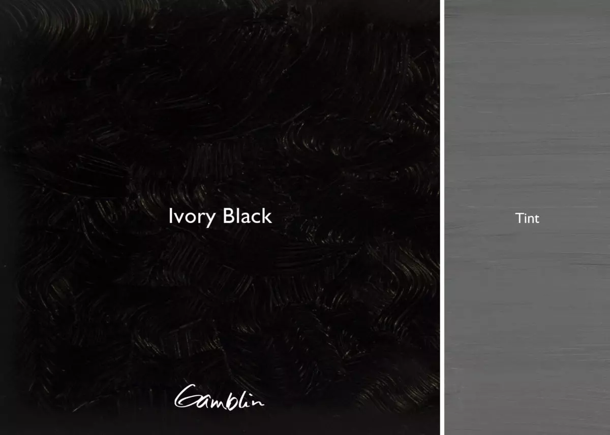
Ivory Black: A good, all-purpose black that’s a solid choice for mixing greys, tinting, and mixing with other colors. Slightly warm in its transparency with a weak tinting strength.
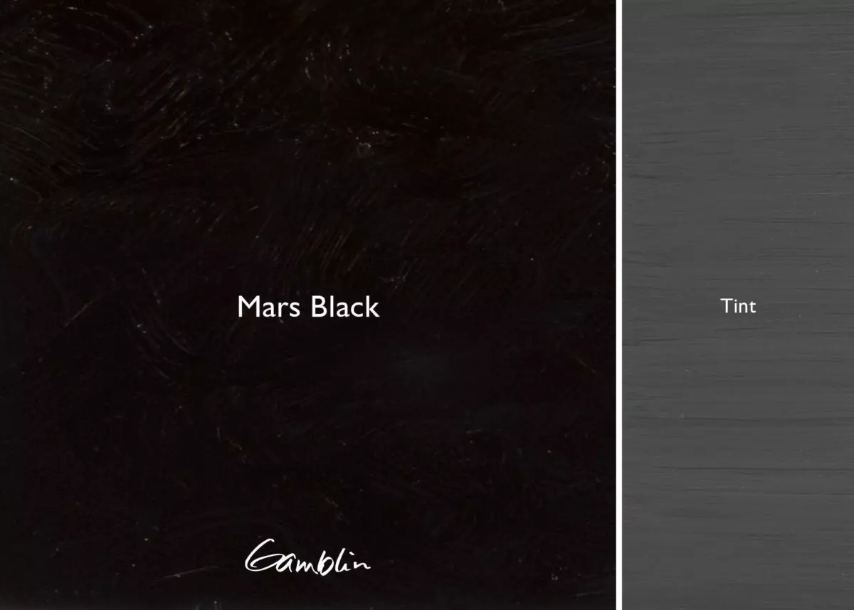
Mars Black: Slightly warm in its tint, Mars Black dries more quickly than Ivory Black. Though not as black as Ivory Black, Mars Black has approximately three times the tinting strength and is very opaque. Cool in its masstone and strong, Mars Black is often the choice of the Neo-Expressionists and others who want to make black opaque marks in thick wet paintings.
Pigment: Chlorinated and bromated phthalocyanine, quinacridone red b (PG36, PV19) Vehicle: Alkali refined linseed oil Lightfastness I, Series 2, TRANSPARENT
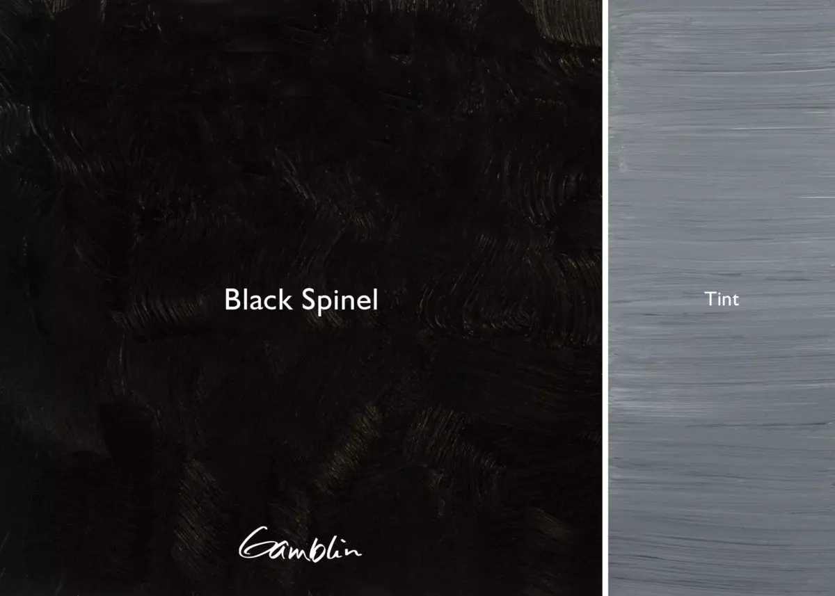
Black Spinel: Because of its pigment’s crystalline shape, Black Spinel dries to a matte finish when no painting mediums are added. Long and ropey in texture, it contains no carbon.
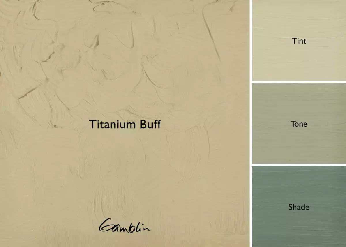
Titanium Buff: A light, yellow-grey made from a compound of titanium dioxide and iron oxide. This popular color is valuable in figurative and landscape painting. Mix Titanium Buff with Portland Warm Grey to create an orange-grey or with Portland Cool Grey to create a green-grey.
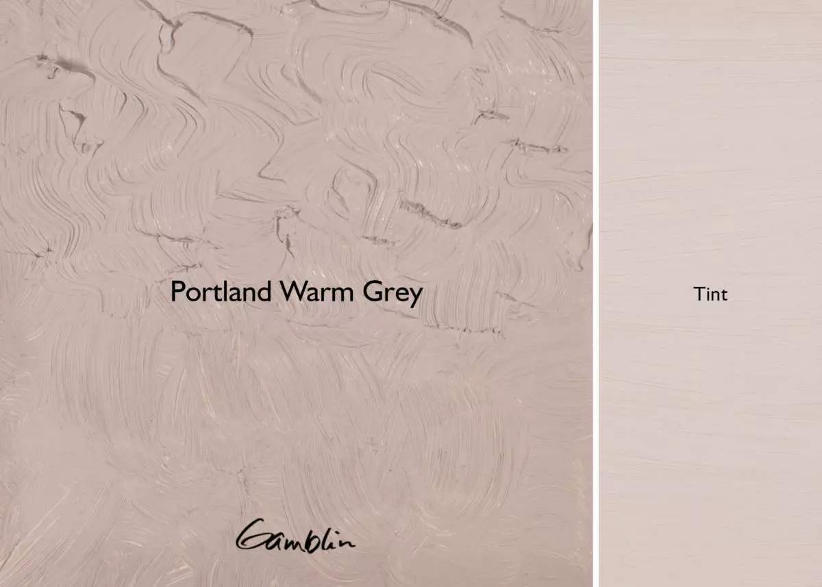
Portland Warm Grey: A middle-value, red-grey. Ideal for reducing the chroma of reds, oranges and yellows. Mix Portland Warm Grey with Titanium Buff to create an orange-grey or with Portland Cool Grey to create a violet-grey.
Pigment: Titanium dioxide, synthetic red iron oxide, synthetic black iron oxide (PW 6, PR 101, PBk 11) Vehicle: Alkali refined linseed oil Lightfastness I, Series 2, OPAQUE SDS
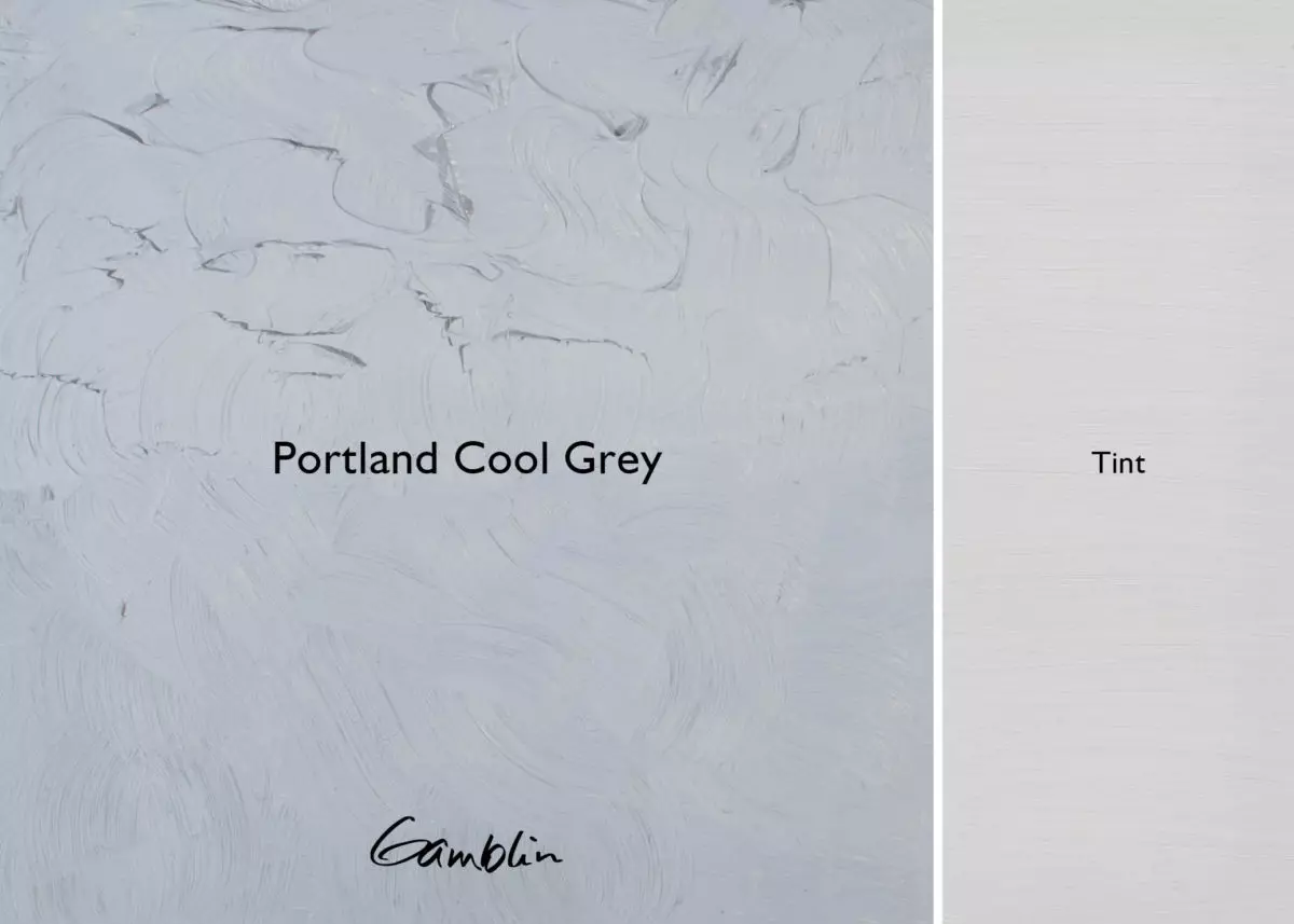
Portland Cool Grey: A middle-value, blue-grey. Ideal for reducing the chroma of violets, blues and greens. Mix Portland Cool Grey with Titanium Buff to create a green-grey or with Portland Warm Grey to create a violet-grey.
Pigment: Titanium dioxide, complex silicate of sodium & aluminum with sulfer, synthetic black iron oxide (PW 6, PB 29, PBk11) Vehicle: Alkali refined linseed oil Lightfastness I, Series 2, OPAQUE
White is the heart of any line of artists’ colors. Between half and three-quarters of the paint on most oil paintings is white, so the white color holds most paintings together.
When selecting white oil colors, consider tinting strength. The more opaque the white, the higher its tinting strength and the more it will “reduce” the color. The higher the tinting strength, the lighter the value of the color/white mixture (tint).
Radiant White, our most buttery white, and Titanium White have the highest tinting strength. Excellent for direct painting styles, they make the brightest, most opaque tints and will reflect the highest percentage of light off the painting surfaces.
The Flake White Replacement project evolved from a prominent artist’s request for Lead (Flake) White, which had been the only white pigment commonly available until titanium dioxide was produced in 1920. Not surprisingly, the artist wanted Flake White’s working properties without the lead. Challenged, Robert tested all the Flake White oil colors on the market and found tremendous differences among them.
To make Gamblin’s version, he matched the working properties generally considered typical of Lead White: warm in color, a dense and heavy paste with a long and “ropey” quality, and a unique look to the impasto stroke.
For a broader discussion of Whites, please visit our Studio Note newsletter, Getting the White Right.
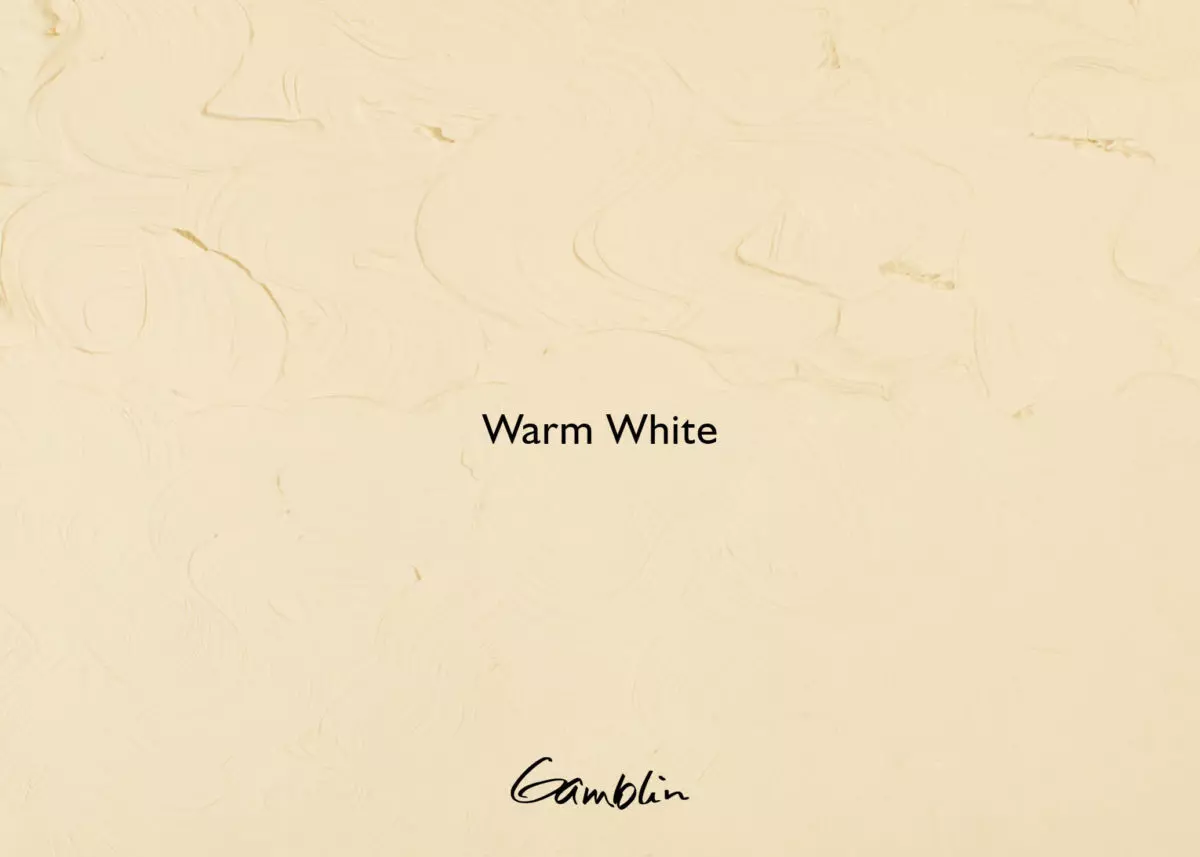
Warm White: Perfect for painters working in warm light situations, such as painting at sunrise or sunset. Based on our Titanium Zinc White formula, it has a perfect balance of yellow and orange pigments to lighten and warm other colors, while maintaining their hue.
Pigment: Titanium dioxide, arylide yellow, monoacetolone, zinc oxide (PW 6, PY 75, PO 62, PW 4) Vehicle: Safflower oil Lightfastness I, Series 1, OPAQUE
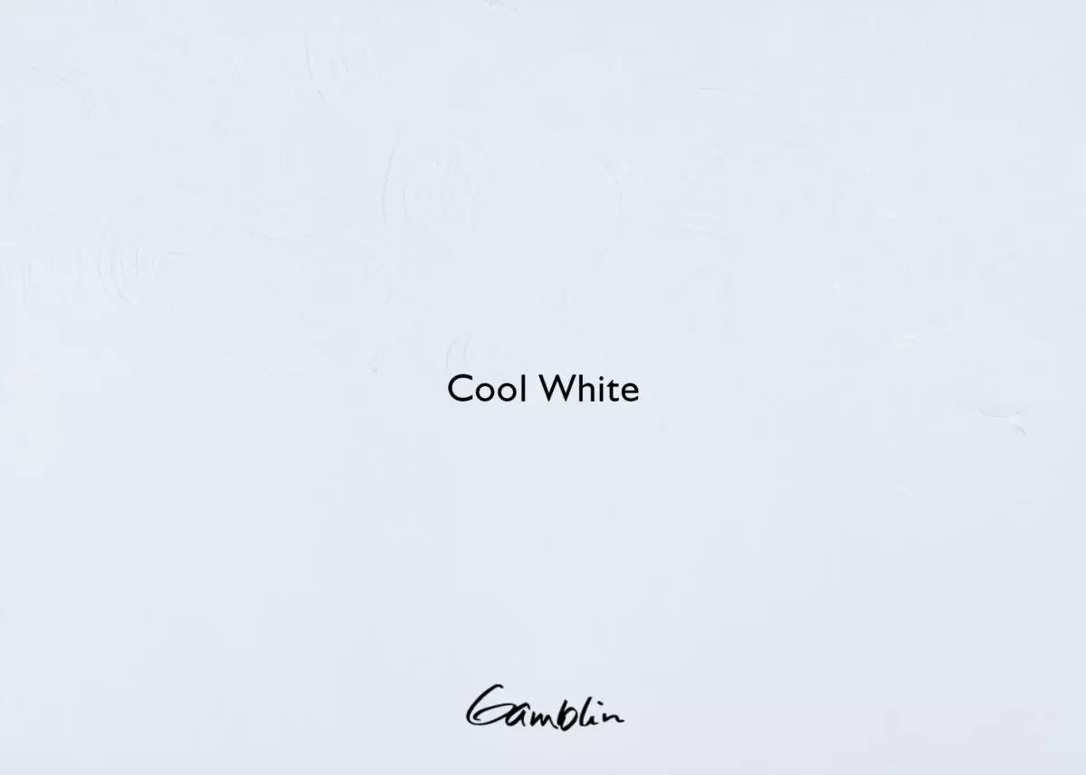
Cool White: Perfect for painters working in cool light situations, such as painting under an overcast sky. Based on our Titanium Zinc White formula, it has a perfect balance of blue pigment to lighten and cool other colors, while maintaining their hue.
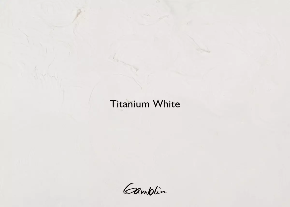
Titanium White: Reflecting 97.5% of all available light, this most opaque white is the perfect choice for direct painting. Monet would have loved it because he wanted his paintings to look soft, like velvet. The covering power of Titanium White is useful for creating opaque layers.
Pigment: Titanium dioxide (PW 6) Vehicle: Alkali refined linseed oil Lightfastness I, Series 1, OPAQUE
Titanium Zinc White: Most useful all-purpose oil painting white. An excellent mixing white, Titanium Zinc White combines the soft texture and opacity of Titanium with the creamy transparency of Zinc for less “chalky” mixtures. Consider using Titanium Zinc White for color-mixing because it takes so much color to tint Titanium.
Pigment: Titanium dioxide, zinc oxide (PW 6, PW 4) Vehicle: Safflower Oil Lightfastness I, Series 1, OPAQUE
Radiant White: A good choice where the color white is critical, Radiant White formulated for painters who want a “refrigerator white” white. Excellent for abstract paintings. Bright and opaque Titanium Dioxide is bound with safflower oil, the clearest oil binder. Because safflower oil is almost colorless, the bright white of the Titanium pigment shows through Radiant White.
Pigment: Titanium Dioxide (PW6) Vehicle: Safflower oil Lightfastness I, Series 2, OPAQUE
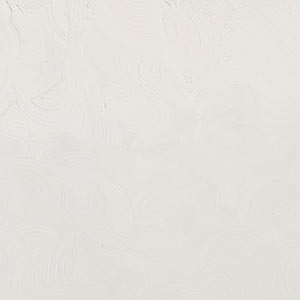
Flake White Replacement: The first true nontoxic alternative to Flake White. Its beautiful opalescent quality is of special interest to portrait painters. Flake White Replacement has all the working properties of traditional Flake White: long ropey stroke, warm color, translucency and short brush mark. Not only does our Flake White Replacement come without the lead but it also doesn’t suffer from the fast drying time of traditional formulations, which contributes to the cracking of oil paintings over time.
Pigment: Titanium dioxide (PW 6) Vehicle: Alkali refined linseed oil Lightfastness I, Series 1, OPAQUE
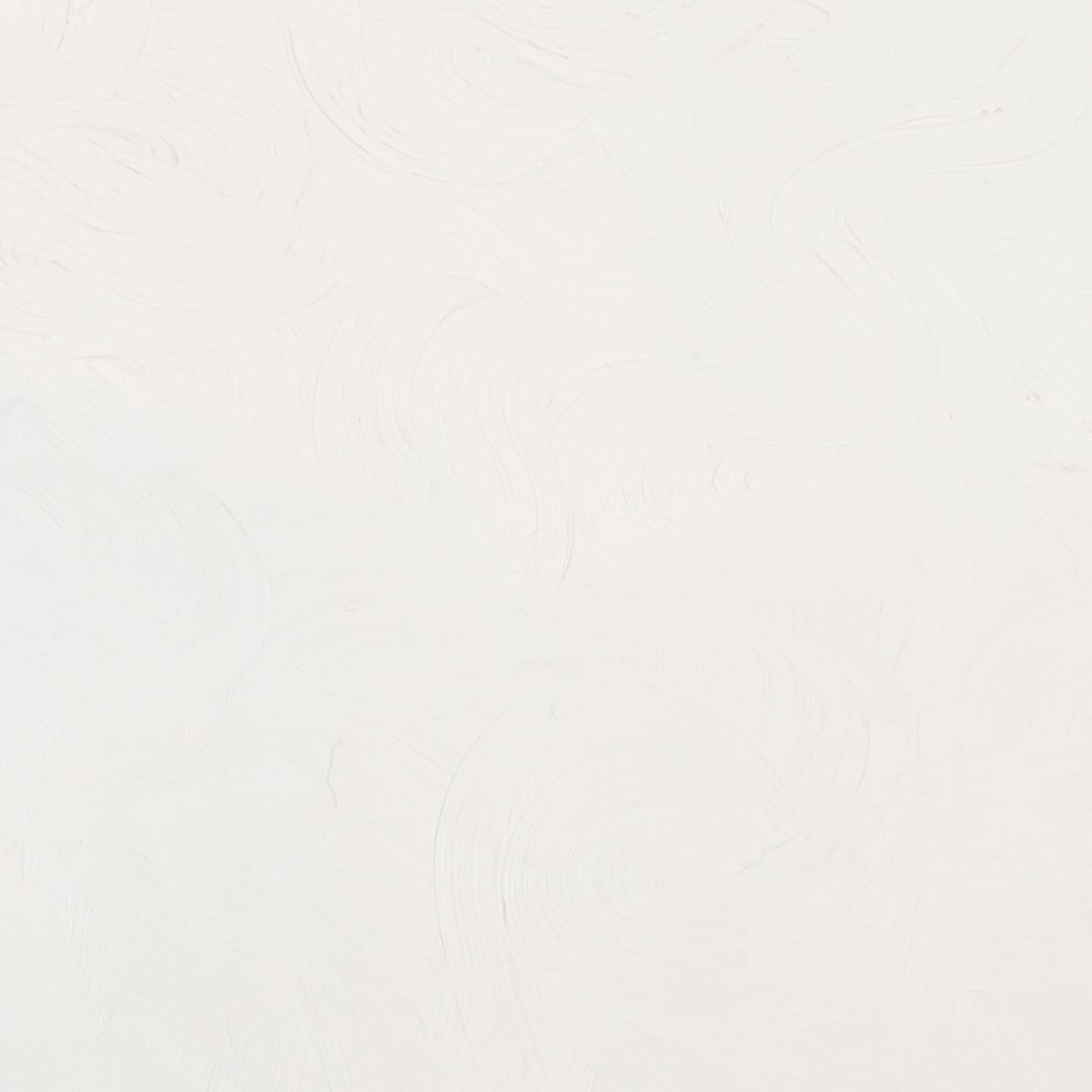
Zinc White: The most transparent white, Zinc is recommended for glazing, scumbling and alla prima painting. Compared with all other whites, Zinc White has less hiding power. Zinc White dries slowly, so painters who want to paint wet into wet over a long time will find it useful. Because it’s brittle, painters should not consider it as a general painting white unless painting on panel.
Pigment: Zinc oxide (PW 4) Vehicle: Alkali refined linseed oil Lightfastness I, Series 1, SEMI-TRANSPARENT
Fast Dry Titanium White: This buttery white is useful for artists who want their paintings to set up more quickly. Fast Dry Titanium White is not as fast drying as Fast Matte Titanium White and has a glossier surface quality.
Prior to May of 2023, this color was named Quick Dry White. The color is the same, only the name changed.
Pigment: Titanium dioxide (PW 6) Vehicle: Alkali refined linseed oil Lightfastness I, Series 1, OPAQUE
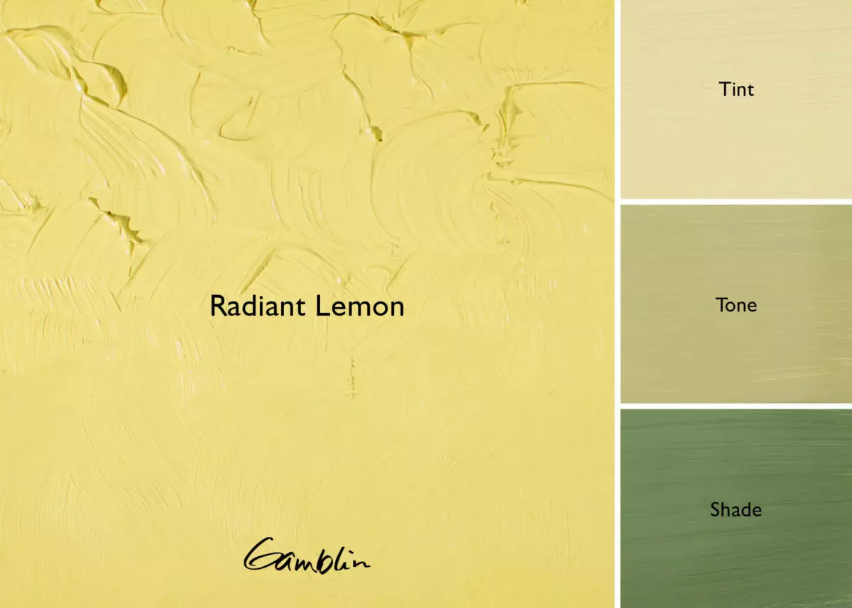
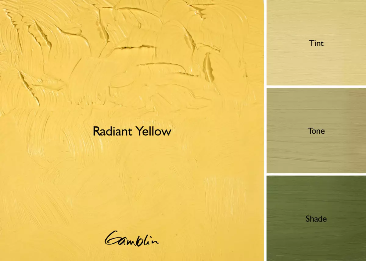
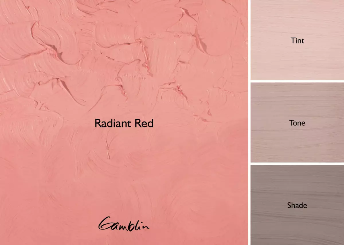
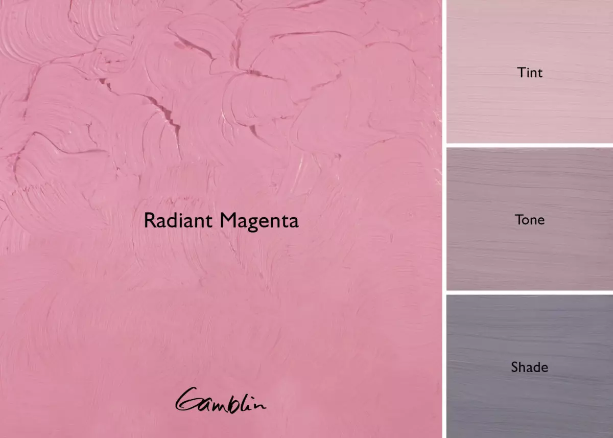
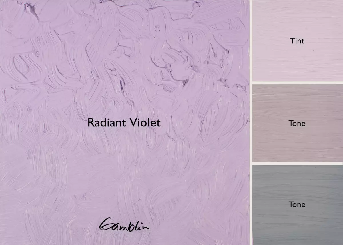
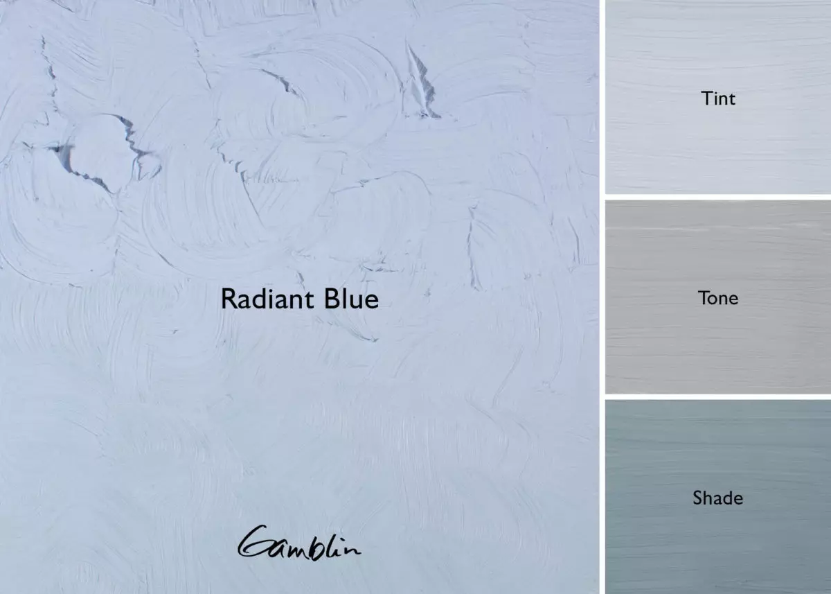
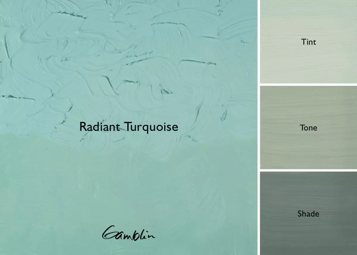
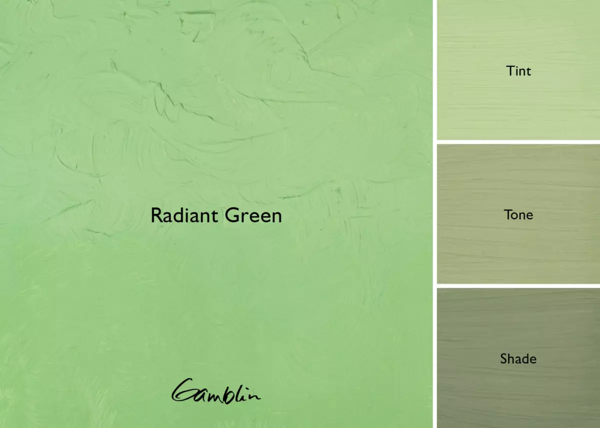
Eight high-intensity tints – mixtures of pure color and white – at Value 7 on the Munsell System evenly spaced around the color wheel. Using the Radiant tints, painters can build traditional underpaintings, then glaze for optical effects of light and shade – enabling painters of today to explore a technique of the past.
Using tints (pure color + white), painters can make the brightest paintings. Using shade [pure color + black], painters can make deep, luminous paintings, accenting with white and tints. Using tone [pure color + white + black], painters can build paintings by value of pure light tints and grey. Learn more about Painting with Radiant Colors.
Pigment: Phthalo Green Y. S., Hansa Yellow Light, Titanium dioxide, (PG 36, PY 3, PW 6) Vehicle: Alkali refined linseed oil Lightfastness II, Series 2, OPAQUE Color Temperature: Warm SDS
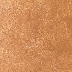
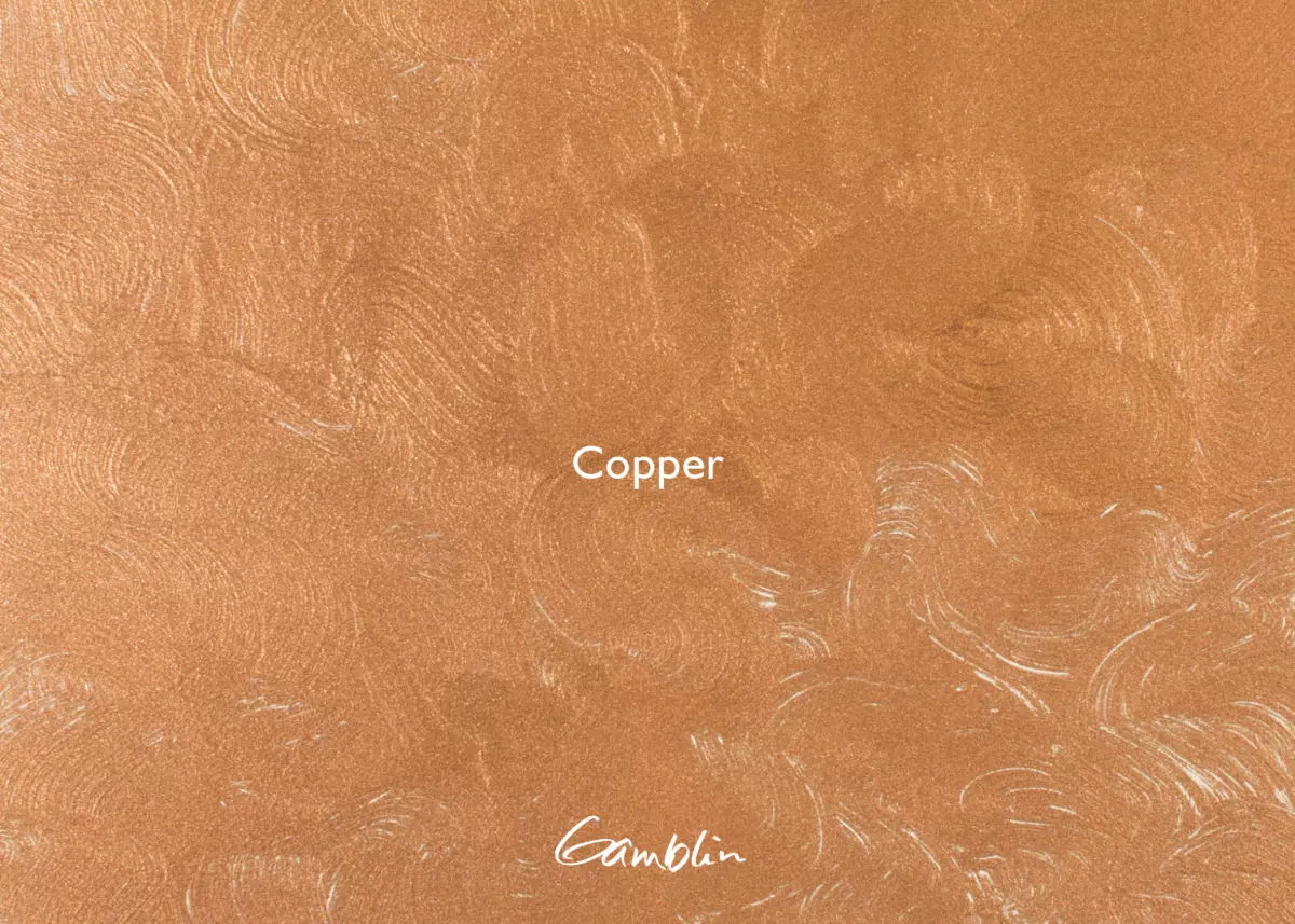
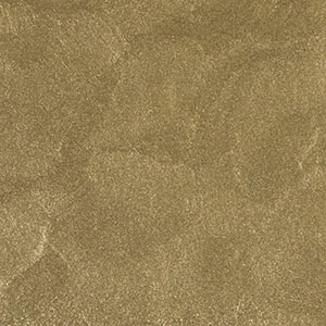
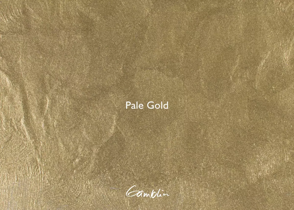
Metallic paint is made of tiny flakes of real metal floating in a clear binder. It’s the light reflecting from all those bits of metal that create the “metal finish.” But though the microscopic flakes are real metal, they don’t line up evenly, so they bounce light around rather than reflecting it directly back at us like a mirror. This is why metallic painted surfaces always have that soft, flat look. The finer the metal flakes and the clearer the binder, the more reflective the surface will be.
Pale Gold: Made from real metal powder and an alkyd resin binder. Pale Gold is green gold. To use it in place of gold leaf, paint over Olive Green. Excellent for painting frames.
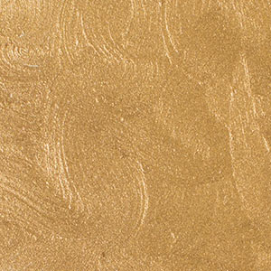
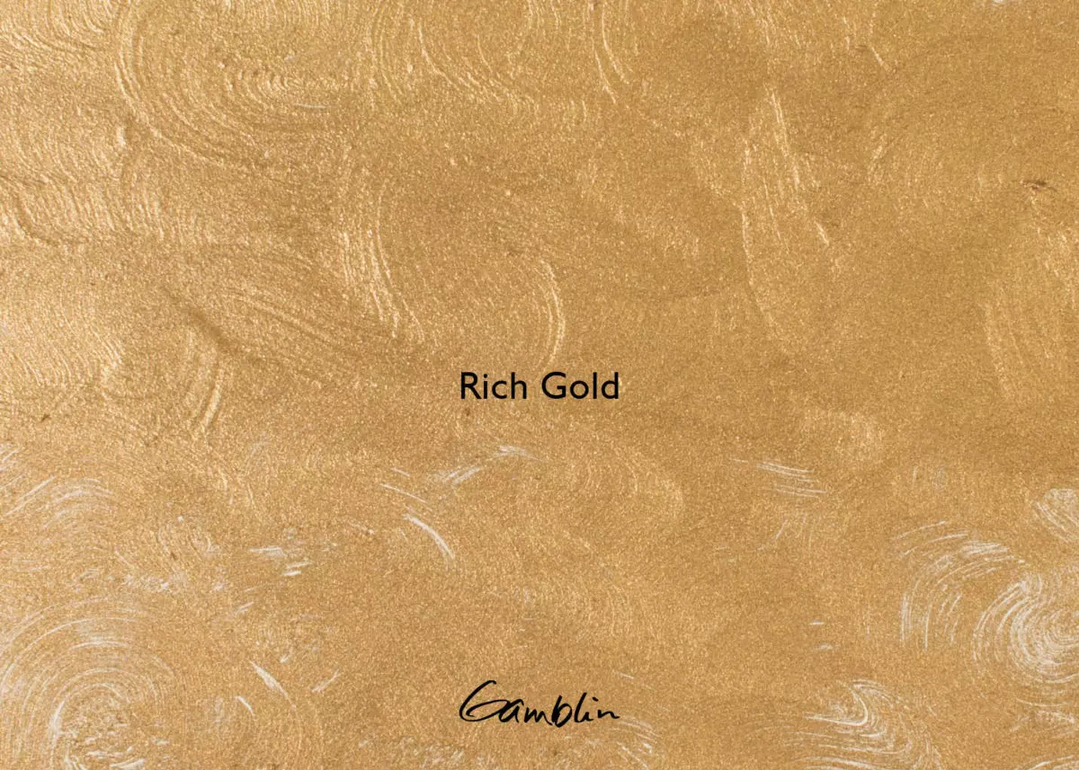
Rich Gold: Made from real metal powder and an alkyd resin binder, Rich Gold is rose gold. Use it in place of gold leaf, painted over Venetian Red. Excellent for painting frames.
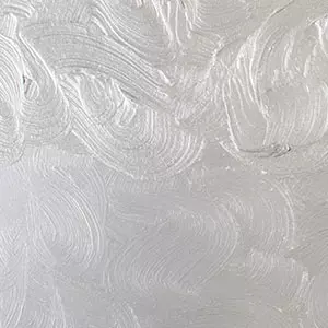
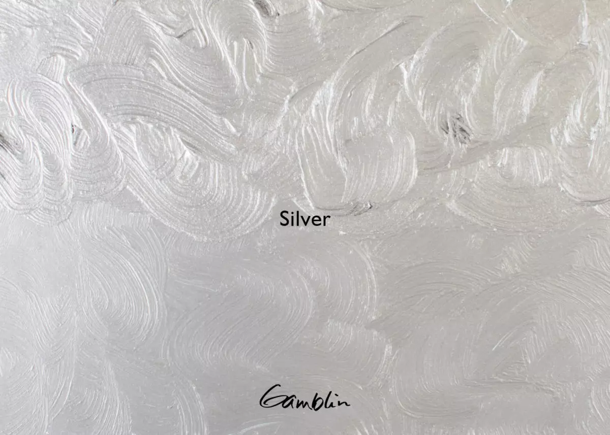
Silver: Made from real metal pigment and an alkyd resin binder. Excellent for painting frames. Can be mixed with transparent oil colors or thinned out and used for a sparkling glaze.